I have two research ideas that I working on. They are both in the same ideal of taking the comic book out of the page and into the real world. As I have explained earlier, I see this as the "analog" version of the webcomic. I started spray painting comics on the wall of a squat/old train shed, but it recently got fire-bombed. A trajic accident not for the artwork on the wall or the collection of garbage and rusted circular saws in the shed, but because of my neighbor's race-pigeon housing being the intended target...
Anyways, the outer walls of the shed I started "publishing" comics on is now black from the fire damage, which gives me an entire new clean-ish surface to work with. I plan on making a wall painting with stickmen as close to life-size as practically and safely possible.
Here is the script for the 1 square wall-painted comic I want to do:
Robber stickman with knife and mask mugs another stickman. He stand on the left of the scene for faster reading purposes (as I have mentioned before in other blog posts, we read English from left to right and top to bottom, therefore for faster readability of the comic the text and images should be situated logically from left to right and top to bottom). The mugged stickman stands on the right looking into his hand.
Mugger: "The money or your life!"
Mugger victim: "I'll meet you half ways. Call it £3.42"
Extremely simple scenario which brings incredibly light humor into a publicly accessible spray painted artwork. The piece will be free to see to all that pass by, making a free self-published "analog" comic.
I tend to spend a lot of time on logistical problems so I am sure everything is executed in a quick and efficient manner. I have achieved a satisfying plan of making a huge stencil with the biggest piece of paper/card I could afford. I will make a giant solid stencil out of it. In fact 3 stencils: 1 for each character and 1 for the text. I am now on the way of thinking on how to create in the most precise manner this stencil. I first thought of drawing it myself on A1 paper. I do foresee the drawing as problematic, not being anywhere used to drawing on such a huge scale, but my main concern lies with the cutting out. All in all, my colleague Mark Rae said to me yesterday that if it where him, he would do it through computers. I think that it is the best solution, especially considering that I need a vectorial program drawn image to have it cut out by a computer and I just so happen to exclusively draw computerised stickmen through Adobe Illustrator which just so happens to be a vectorial program. I plan to use this to create my stencil.
I now have to design the comic on illustrator and experiment with the best stencil techniques to create a clean and functioning giant stencil.
My second project I am also prototyping for alter is the creation of a stickman statue with a white-board/dry eraser board located in the speech bubble. This would allow for the public to add their own story and text to the statue of the stickman, and create an simple, free and playful/recreational publicly accessible comic book creator. On the internet there a dime-a-dozen free Flash programs to create and design your own comics through pre-made artwork and speech bubble tools. This would be a less elaborate and simpler "analog" alternative, bringing the Flash comic book programs to the public.
This would be a participatory and performance-like public project. Although to do this, I have to create the statue, and as for the stencil I like to plan ahead and have a clear and precise plan. The create the statue I need to choose material: re-bar or metal would be my first choice as an aesthetically and tactilely pleasing material to create a stickman out of. In addition to that, welding a speech bubble onto it would be easier and have a high production value statue feel to it. Although this would be a good approach for someone with the time and resources which I dunno posses, I find it would also be very hard to transport and impractical, therefore removing the option of a more mobile statue.
Like the stencil, I foresee myself creating the statue in 2 to 3 pieces from wood carved/shaped through a computer based vectorial program. This creation would be completely 3 dimensional and I am quite new to the creation process therefore more research on that part of the production is needed. A part from that, I have thought about the shape/form of the statue and mainly the way it would be part together: a base, a stickman and a speech bubbly made from wood and spray painted black matt or semi-gloss. The material are cheaper and lighter than metal and allow for much for manoeuvrability. In addition to this the stand would be relatively cheap to create as well as stable. For the stickman, carving him from one solid piece of wood might not only be problematic but also impractical. Therefore he could be divided into 2 pieces at the mid-section. A bolt could be placed inside the body of the stickman allowing for an easy way of putting the piece together as well as making it more transportable.
My main logistical problem for choosing wood as a material of choice is the speech bubble which would need a very solid support, therefore the positioning of it has to be carefully thought through for safety and stability reasons, and to create a solid enough speech bubble that has enough support from the main statue piece. It could be detachable and connectible through a bolt to the main piece. The centre of the speech bubble would be a modified whiteboard shaped as needed, and allowing the public to easily add their text to the scene, allowing them to add their own input to the life comic book scene.
Illustration and plans are still to be finished.
Showing posts with label Experimentation. Show all posts
Showing posts with label Experimentation. Show all posts
Thursday, 11 March 2010

Wednesday, 3 March 2010
http://www.stickmencomics.com
I started my very own webcomic. I decided, on the 3rd of January, that I would get some webspace and expand from my research oriented blog and publish my comics to the public. One month later, it was live. Now, it's all set up and running fine.
First of all, I had the idea that for the website's design to hand-draw the whole website. I do have a few words typed in, but it was mostly in case someone couldn't read my handwriting. The website is simple. That's all I wanted, simplicity and with a sensation of the website being an odd mix of hand drawn design on a purely digital publishing medium. I really like that contrast of digital perfectly solid black line and the pen drawn "black" line which had the waves, strengths, weaknesses, and swerves of black ink, being so perfectly imperfect.
The website is constructed on the basic webcomic template after studying other webcomic website designs. The main inspiration in its simplicity was XKCD. Although my website has very specific originalities which can easily be overlooked but has great impact on the actual content, impact and delivery of the webcomics. The website has only 3 pages: home (where the comic browser is), archives (to find speicific comics) and info (where I briefly explain what I am doing and leave my author's email - fnic@stickmencomics.com). The main impact of the website design on the comics is the home page on which I allocated a browser space which has a width of 595 pixels. It just happens I chose that width because it is the pixel equivalent width of A4 paper. Added to that, the only design "perk" I added to my website were the sidebars which impose a certain height for the browser. All in all, I purposely limited my publishing area for my comic books to A4 or "letter" size comics. Most of the webcomics I have viewed have their own self-imposed format, although largely favoured layout is in "strip" format, or landscape.
The technical difficulty is the viewer has to scroll down to see the whole comic. It has up sides and down sides. The main up side is that the down side of the comic isn't visible. This allows for an effective delivery of the punchline. That is a worry because the text is as important of as the art. Therefore it is important to get the viewer to read the last part of the comic last. On the really down side is that on a small screen, say a 15" with 800x600 resolution, the whole website isn't visible. I considered that, then I thought: "people who still use those screens are: 1/at work, 2/ using a very old home computer screen". Therefore I decided to continue with my project the way it was thinking that demographic of readers wouldn't exactly be those who read my webcomics.
The archive cause me a bit of grief. It was the hardest decision to take, not because of technical advise but mainly because of design practicalities and layout. The archive has to make it easy for one to find a specific webcomic quickly, which also keeping loading time into consideration. Flash could have done the job but now more and more security systems block flash. Thumbnails would have been too network heavy, and a browser would have the process too long. Thus my choice of a unique list, as used on XKCD, but organised and laid out in a more specific and user friendly way. My only question that remains is: "should I keep the sidebars and if so, should I impose a heigh limit on the table enabling a scroll bar on inside the actual archive?". I still have not made up my mind.
My webcomics can be found on my website: http://www.stickmencomics.com
First of all, I had the idea that for the website's design to hand-draw the whole website. I do have a few words typed in, but it was mostly in case someone couldn't read my handwriting. The website is simple. That's all I wanted, simplicity and with a sensation of the website being an odd mix of hand drawn design on a purely digital publishing medium. I really like that contrast of digital perfectly solid black line and the pen drawn "black" line which had the waves, strengths, weaknesses, and swerves of black ink, being so perfectly imperfect.
The website is constructed on the basic webcomic template after studying other webcomic website designs. The main inspiration in its simplicity was XKCD. Although my website has very specific originalities which can easily be overlooked but has great impact on the actual content, impact and delivery of the webcomics. The website has only 3 pages: home (where the comic browser is), archives (to find speicific comics) and info (where I briefly explain what I am doing and leave my author's email - fnic@stickmencomics.com). The main impact of the website design on the comics is the home page on which I allocated a browser space which has a width of 595 pixels. It just happens I chose that width because it is the pixel equivalent width of A4 paper. Added to that, the only design "perk" I added to my website were the sidebars which impose a certain height for the browser. All in all, I purposely limited my publishing area for my comic books to A4 or "letter" size comics. Most of the webcomics I have viewed have their own self-imposed format, although largely favoured layout is in "strip" format, or landscape.
The technical difficulty is the viewer has to scroll down to see the whole comic. It has up sides and down sides. The main up side is that the down side of the comic isn't visible. This allows for an effective delivery of the punchline. That is a worry because the text is as important of as the art. Therefore it is important to get the viewer to read the last part of the comic last. On the really down side is that on a small screen, say a 15" with 800x600 resolution, the whole website isn't visible. I considered that, then I thought: "people who still use those screens are: 1/at work, 2/ using a very old home computer screen". Therefore I decided to continue with my project the way it was thinking that demographic of readers wouldn't exactly be those who read my webcomics.
The archive cause me a bit of grief. It was the hardest decision to take, not because of technical advise but mainly because of design practicalities and layout. The archive has to make it easy for one to find a specific webcomic quickly, which also keeping loading time into consideration. Flash could have done the job but now more and more security systems block flash. Thumbnails would have been too network heavy, and a browser would have the process too long. Thus my choice of a unique list, as used on XKCD, but organised and laid out in a more specific and user friendly way. My only question that remains is: "should I keep the sidebars and if so, should I impose a heigh limit on the table enabling a scroll bar on inside the actual archive?". I still have not made up my mind.
My webcomics can be found on my website: http://www.stickmencomics.com
Sunday, 13 December 2009
More dual medium: mixing realities
Here's a few more dual medium (picture and graphic tablet drawn stickmen) That I've been experimenting with.

I really like the brush effect done on this one. It looks a lot like the 1.5 mm fountain pen I use in my hand-drawn comics. On the opposite, there is the following picture done with a the basic brush from Adobe Illustrator.


Sunday, 6 December 2009
Stickmen, white space, and the internet
Stickmen, stickmen, stickmen... They are all over my comics. Why? Well one answer is because I can't draw anything else... but I asked myself a quite important question: if I could draw other things, would I? No. I would not. I like drawing stickmen, and they are an essential part of my comic book design. They fit into my storytelling, my use of grids and my experimentations, especially with white spaces and photographies.

Stickmen, and basic drawings seem to be part of this new era of webcomics. With the internet as the biggest publishing medium in the world, the democratisation of software through piracy and the low cost of hardware, anyone can pick up a graphics tablet, do a stickman, and narrate away in comic book format. Despite the basic artwork, these comics work because the stories and the design go hand in hand with the stickmen.
xkcd are very popular:

And white ninja has had quite a success:

And Cyanide & Happiness just had a book published as a compilation of their best comics:

Would these work as well if they didn't have low quality drawings? I don't think so. The artwork, the simplicity and the white space is what makes these comics loveable. The comedy and the joke is told as much by the appearance of the characters as by the action development (grid/layout) as by the text.
"The visual representation of the characters will of course, depend on the artists inherent style. This can mean that the design may consist of anything from a stick figure to a fully rendered or photo-realistically painted character." Gary Spencer Millidge, Comic Book Design, p.16, Watson Gutwill: New York, 2009.
Lewis Trondheim, a very well know and respected French comic book artist, which has done such things as A.L.I.E.E.E.N. that has been translated into English, as well as the cat symbol of the Festival de la BD d'Agoulème, the Trondheim cat; has always had a style described as "pared-down cartooning to design different-looking extraterrestial monsters with just a few lines" (p.17, Millidge, G.S., 2009)


Above: A.L.I.E.E.E.N. and The Angoulème Cat by Tronheim.
On the simple character design and comedy side of things, others have managed to become quite well know on good design through comedy, good writting, and great and simple characters.
Simon's Cat, by Simon Tofeild, has just had a book of short comics published, but the cat initially started as short videos on YouTube:
Garry Larson's The Far Side doesn't need any introduction:

And Andy Riley's Suicidal Rabbits (The Bunny Suicides) born and bred in the U.K. are a endless source of joy and he is described as the British Gary larson:

I have myself been experimenting further with white space, stickmen, simplicity, and comedy.


Stickmen, and basic drawings seem to be part of this new era of webcomics. With the internet as the biggest publishing medium in the world, the democratisation of software through piracy and the low cost of hardware, anyone can pick up a graphics tablet, do a stickman, and narrate away in comic book format. Despite the basic artwork, these comics work because the stories and the design go hand in hand with the stickmen.
xkcd are very popular:
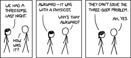
And white ninja has had quite a success:

And Cyanide & Happiness just had a book published as a compilation of their best comics:

Would these work as well if they didn't have low quality drawings? I don't think so. The artwork, the simplicity and the white space is what makes these comics loveable. The comedy and the joke is told as much by the appearance of the characters as by the action development (grid/layout) as by the text.
"The visual representation of the characters will of course, depend on the artists inherent style. This can mean that the design may consist of anything from a stick figure to a fully rendered or photo-realistically painted character." Gary Spencer Millidge, Comic Book Design, p.16, Watson Gutwill: New York, 2009.
Lewis Trondheim, a very well know and respected French comic book artist, which has done such things as A.L.I.E.E.E.N. that has been translated into English, as well as the cat symbol of the Festival de la BD d'Agoulème, the Trondheim cat; has always had a style described as "pared-down cartooning to design different-looking extraterrestial monsters with just a few lines" (p.17, Millidge, G.S., 2009)


Above: A.L.I.E.E.E.N. and The Angoulème Cat by Tronheim.
On the simple character design and comedy side of things, others have managed to become quite well know on good design through comedy, good writting, and great and simple characters.
Simon's Cat, by Simon Tofeild, has just had a book of short comics published, but the cat initially started as short videos on YouTube:
Garry Larson's The Far Side doesn't need any introduction:

And Andy Riley's Suicidal Rabbits (The Bunny Suicides) born and bred in the U.K. are a endless source of joy and he is described as the British Gary larson:

I have myself been experimenting further with white space, stickmen, simplicity, and comedy.

This one's quite Gary Larson-y in style...

Wednesday, 11 November 2009
Mixing realities
Real life has quite often been translated directly into comic books. Fluide Glaciale, a franco-belgian adult comic book magazine that has been running since 1975. One of the first adult comic publications after the amendment of:
The law "n°49.956 of the 16 July 1949" which imposes censorship on comics which portray in any positive manner: "lying, stealing, debauchery, hatred, cowardliness, laziness, (and from 1954) ethnic prejudice" (Mouchart, B., 2003, p. 25).
Fluide Glaciale has since 1975 published comic series of pictures layed out and narrated as a comic book. As can be seen in this extract from Fluide Glaciale, Gay Friendly, Serie Or #30, 2005

This medium of comics does not really work for me because of the fact that it's just "too real". Like many other entertainment media, comic books are there to take people away from their daily lifes to another person's or even to magical fantasy lands.
My vision of a cross media comic book is further from reality. Drawing via a graphic tablet on digital photos is a way of putting together comic books which is actually extremly appealing to me. Although it has to be done in a specific way: picture background and cartoon characters. I cannot bare the idea of the opposite. It has been done many times, and mainly through the 1988 famous movie Who Framed Roger Rabbit (memorable not only because of its cross media effects but also for being the only Warner Brothers and Disney collaboration). This can also be seen in the Disney classic Mary Poppins when the main characters go into a fantasy picture where all the special effects were cartoons.
I don't think anyone can compete, even nowadays, with Roger Rabbit.
My adaptation of this technique, using only Adobe Photoshop and a graphics tablet gives this:

This is far from being as legendary as Roger Rabbit, but the harshness of reality against the thick clumbsy lines of my novice graphics tablet brush strokes create a contrast which is greatly inspired from Who Framed Roger Rabbit. Like the movie, this brings cartoon characters to our world, allowing us to identify with them, while keeping a safe distance with fantasy.
The law "n°49.956 of the 16 July 1949" which imposes censorship on comics which portray in any positive manner: "lying, stealing, debauchery, hatred, cowardliness, laziness, (and from 1954) ethnic prejudice" (Mouchart, B., 2003, p. 25).
Fluide Glaciale has since 1975 published comic series of pictures layed out and narrated as a comic book. As can be seen in this extract from Fluide Glaciale, Gay Friendly, Serie Or #30, 2005

This medium of comics does not really work for me because of the fact that it's just "too real". Like many other entertainment media, comic books are there to take people away from their daily lifes to another person's or even to magical fantasy lands.
My vision of a cross media comic book is further from reality. Drawing via a graphic tablet on digital photos is a way of putting together comic books which is actually extremly appealing to me. Although it has to be done in a specific way: picture background and cartoon characters. I cannot bare the idea of the opposite. It has been done many times, and mainly through the 1988 famous movie Who Framed Roger Rabbit (memorable not only because of its cross media effects but also for being the only Warner Brothers and Disney collaboration). This can also be seen in the Disney classic Mary Poppins when the main characters go into a fantasy picture where all the special effects were cartoons.
I don't think anyone can compete, even nowadays, with Roger Rabbit.
My adaptation of this technique, using only Adobe Photoshop and a graphics tablet gives this:

This is far from being as legendary as Roger Rabbit, but the harshness of reality against the thick clumbsy lines of my novice graphics tablet brush strokes create a contrast which is greatly inspired from Who Framed Roger Rabbit. Like the movie, this brings cartoon characters to our world, allowing us to identify with them, while keeping a safe distance with fantasy.
Wednesday, 4 November 2009
Don't take that so litteraly!

There the ones who put it up!

Yeah... You can get anything out of anything if you look hard enough

They should make those signs clearer. Drinky Crow got confused as well. A suicide hotline doesn't mean they should try to stop you from committing suicide, foot fetish hotlines don't try to get you out of your foot fetish.
"Vandalising" or curating the world!
Vandalising is a word which suggests some malicious idea...


Vandalise
/ˈvæn.dəl.aɪz/ v [T]
to intentionally damage property belonging to other people

The only loop-hole in that definition is the word "damage". I don't think I'm damaging the property of others, I'm enhancing it in a positive way. So far I only have 2 places I've worked on: a stool in the St. Nicholas' Kirk graveyard.

I really like the idea of writing on things that don't belong where they are. Like a 1960's in the middle of a graveyard in the centre of town. I like the "take that society" just because it is what everyone is trying to say in one way or the other when they do vandalism. The humour in it is that anyone who writes on walls is trying to say "take that society" in the most complex way their artistic spirit can come up with. I decide to revert to the most basic message state and have stick-people comment on my "take that society".

In the area (on the border of Woodside and Tillydrone) where I spray painted quite poorly this first piece of my curatorial exhibit was, in my defence, my first ever spay painted stencil on a wall, at night (and it was very very dark). The challenge with this entire wall, that I intend to apply my spray painted short comics, is to find a quite universally understandable message. I think "why not consider abduction" has a universal social appeal, plus, I feel I'm doing my part to help aliens probe the world. The stick-man and the spray painting medium have something that reminds of stone age art and cave-wall paintings. I am hoping that if found in the future, this mural would be analysed as are cave-men drawings now. I just feel that despite all our technology, the best way to carve something in stone, is to carve it in stone... or spray paint it on a wall.


In the area (on the border of Woodside and Tillydrone) where I spray painted quite poorly this first piece of my curatorial exhibit was, in my defence, my first ever spay painted stencil on a wall, at night (and it was very very dark). The challenge with this entire wall, that I intend to apply my spray painted short comics, is to find a quite universally understandable message. I think "why not consider abduction" has a universal social appeal, plus, I feel I'm doing my part to help aliens probe the world. The stick-man and the spray painting medium have something that reminds of stone age art and cave-wall paintings. I am hoping that if found in the future, this mural would be analysed as are cave-men drawings now. I just feel that despite all our technology, the best way to carve something in stone, is to carve it in stone... or spray paint it on a wall.

Friday, 16 October 2009
Does this work?
I've been working on my stick-man. There are a few reasons for working with stick-men. It's not just because I can't draw, although that is one big reason. There are a few things I like to do with stick-men:
1. I cannot draw
2. I really like to explore stick people. I like to explore the bare minimum needed to narrate effectively a story. This also allows me to find out which details transmit which expression.

On this stick-man, I tried 3 things to get that thinking effect: I angled the eyes, but that was not enough, so I added the smile, but that still didn't work so just needed to add the hand to get the full thinking look. Details are what make a story true. Frank Miller's Robocop is great not because of the Murphy, the robot cop, but because of all the cyber-punk details in the background of the comic (and movies) are what make the whole world of Robocop complete.
3. To have fun and see what works and doesn't work in stick-man form. It's great to explore it because stick people are the more basic characters for comic books.
In this stick-man version of Fantastic 4 one can really see that The Thing doesn't really work, but it's really funny.

1. I cannot draw
2. I really like to explore stick people. I like to explore the bare minimum needed to narrate effectively a story. This also allows me to find out which details transmit which expression.

On this stick-man, I tried 3 things to get that thinking effect: I angled the eyes, but that was not enough, so I added the smile, but that still didn't work so just needed to add the hand to get the full thinking look. Details are what make a story true. Frank Miller's Robocop is great not because of the Murphy, the robot cop, but because of all the cyber-punk details in the background of the comic (and movies) are what make the whole world of Robocop complete.
3. To have fun and see what works and doesn't work in stick-man form. It's great to explore it because stick people are the more basic characters for comic books.
In this stick-man version of Fantastic 4 one can really see that The Thing doesn't really work, but it's really funny.

Thursday, 1 October 2009
Ok... I'm full of self doubt now, lets get started!
Second day of university and banzai, we're doing presentations of our work. It's nice to see what other people have done, and get to know them a bit more. Only thing is these presentations have made me feel like a guy who draws pictures of Jesus on the side-walk in a room full of... brilliant artists... I do have to admit, that was not the most witty thing I ever wrote.

Yeah, that's kind of the way I feel... The added "Shut up & don't move" at the end is not there to show that the world is a cruel place, but more to remind myself to stop whining and get on with it!
Well here goes nothing!

Yeah, that's kind of the way I feel... The added "Shut up & don't move" at the end is not there to show that the world is a cruel place, but more to remind myself to stop whining and get on with it!
Well here goes nothing!
Subscribe to:
Posts (Atom)