Showing posts with label Research. Show all posts

Friday, 9 July 2010

Adpating comics for the web

I've already posted on part of what I'm going to write here a while back when I compared webcomics and their layout to translated manga, and English adaptations. I'll just come back to this a bit later.

I've been reading Will Eisner's "Comics, a Sequential Art," and have been putting my readings in parallel with my webcomic. Will Eisner analysed, like quite a few other comic book experts like Thierry Groenstein and Scott McCloud, the sequence and design of comic books. When you look into the design of a single page and it's sequential art inside that defined space, webcomics work in the same way. The pages in most webcomics can be read following the "right to left, up to down" occidental reading method.

I've illustrated this by adapting a couple of sequential pages of a speechless comic into an animated .gif picture. This experimenting has allowed me to explore and visually demonstrate quite a few differences, similarities, obstacles, and adaptation techniques of printed comic books to webcomics.

I have adapted these 2 comic pages into the following .gif:

The images in the comics have been organised in the .gif file in the logical sequential reading order. This brings me swiftly to two points: adapting printed sequential art to the internet, and digital medium sequential artwork representations which cannot use digital technology that cannot be reproduced in printed form. That sounds really long, but what I mean by that is that there's quite a few ways to adapt a printed comic into a digital sequential art form, but only one way to go adapt it the other way around.

In the digital world, the tools are infinite to tell a sequential story, and mixing the media to create a digital comic book, say like mixing the layout of the comic, but adding animation to some of the page and images allows for a whole new storytelling method that cannot exist (without a substantial budget, resources and research) in a physical print form. All I'm saying here is that by digitalising comic books, many more options are given to us a part from the printed sequential form.

Now if one has a look on my webcomic browser and remembers the previous post I have written about webcomic browsers, which can be summed up easily by: webcomics favour people revisiting the website to newcomers by placing the latest page/comic in the place of honour. On my webcomic, while placing the 2 directly sequential pages which should/would be following each other in an order that would make the most logical sense. Therefore adapting this to a new medium causes some logistical problems (as I like to call them). This is just worth pointing out seeing as I already discussed quite extensively the reasons for my browser setup on my website. One has a choice to make, and generally, like most choices each decision contains pros and cons. The pros outweigh the cons, but the frustration of not having a perfect system is there: what if I put a few sequential pages on my webcomic, and people read the end before the beginning because of the browser setup? Nothing is perfect.

Tuesday, 11 May 2010

How's my site doing?

I stuck Goolge Analytics on my website, and I get all sorts of fun statistics. So here's some of them from the last month (10/04/2010 to 10/05/2010):
That's the numbers of visitors per day over the last month.


And that's the statistics on the number of new visits and such.


That's where in the world they visit from.
I use to be able to pin-point exactly who visited me from where, but now I lost track, and I don't know a lot of people who visit my website.

 That's just the list version of the map.

That's the 4 cities that I get the most visits from in the UK. 
Aberdeen get 73 visits, London is second with 14, then Edinburgh and Sale.

That's how people get onto my website.
I'm now second on Google when you search for "stickmen comics".

That's what people searched in the search engines.

All in all, my website visits are booming, and I'm now listed on a website called "stumbleupon.com" which gets me quite a few random visits. I haven't tried to qualify for add-space since I just started my website, but I don't think I will, mainly because it wouldn't get me any revenue and ruin the aesthetic of my website.

Nota Bene: If you can't read the statistics, click on the image to enlarge it.

Tuesday, 30 March 2010

Orc Stain - Colours, design, and creativity,

Orc Stain is a new comic from Image Comics, probably the biggest "independent" comic book company there is. The first issue was released last month, and there's only one man behind it: James Stokoe. He created, wrote, drew and coloured Orc Stain. There's a theory amongst comic book artists that one man crews do a better job at creating comics than the classic writer/artist duo. The theory comes from quite a long series of examples, like Chris Ware, Daniel Clowes, Denis Bajram, and Eric Hérenguel, just to name a few. The idea is that when you work alone, there's no comprise to be had with the creative idea behind the comic book, but that seems to be a debate that has been going on for as long as "art" has been around.

Moving on from this one man crew system, Orc Stain is without a doubt in my mind the most creative American comic book released this year. I am trying not to get too caught up in my enthusiasm about this comic book. To be fair I did wait until issue 2.

Orc Stain is full of colour, the shades are incredible, and the design of every single creature and scene in this comic is absolutely amazing and represent a source of creativity which I have rarely seen in American comic books. The fact is that, by "tradition" most creative and experimental comic books have been European. American comics are still under the influence of DC and Marvel Comics. Paul Gravett, comic book publisher, curator, artist, and critic talks about this overwhelming reign of influence of Marvel and DC as a very negative movement and influence in the comic book world. The American comic book world is extremely oriented around superheroes. The industry is so caught up in the superhero business, especially with Hollywood buying all the superhero films rights. So much so that non-superhero American comics have become rare.

"Why is Orc Stain so special?" might you ask. In this comic, in addition to the design and colour work James Stokoe brilliantly created, there is a brand new imaginative world with an original story, great characters, and overall a comic that knocks down all boundaries. A one-eyed orc safe cracker as a main character is brilliantly imaginative, especially when you learn that the safes are big bear-like creatures with an ancient safe-lock system on there stomach. Need I say more?

Monday, 22 March 2010

Simply genius comic book design

I don't know how many people know the Moomins, but I just got my hands on a beautiful edition of the English translation of the original comics. This comic was started in 1945, and went on until 1993, and the design of the comic is absolutely genius.

Tove Jansson created in the Moomin comic book amazing designs and comic book flow. The use of the hose as the frame of the comic and making it lead in such a clever way from square to square it a beautiful design method allowing for a smooth flow of the story and the artwork across the page. The detail of the details create a very playful design and flow that all can appreciate.

On further extremely good design, a young artist from Brighton comes to mind: Hannah Berry. I often think of her when I am designing my own comics and thinking about the narrative flow and boundaries of my comics.


In the opening page of Britten & Brülightly, by Hannah Berry, nominated this year for the grand prize of Angoulème comic book festival, one can see a comic book page with no traditional block boundaries between the action in the comic. The text is not in speech or though bubbles, the images create their own boundaries and the flow of time is expressed in the simplest way. The simplicity of the narration flow comes through the balance of the artwork and the storytelling, allowing for the images to flow naturally and the story to be told in an original and artistic manner. Hannah Berry, as I do, uses white space to separate the the frames of the comic book and lets the natural boundaries of the images be self sufficient. The narration through images comes so naturally that one is instantly drawn into the comic book.

Tuesday, 9 March 2010

Self critic in my work

I never really realised until recently that I did quite a lot of self-critic of my work in my work. I didn't realise this because I did most of these self critic comics to express my insecurities about my work. It's also my way of being honest and saying "I'm no artist, but Hell, I'll keep doing this until someone stops me." Apart from my deep sense of insecurity, I like admitting most of my work is poor on an artistic scale, mainly because I'm aiming to explore the design perspective of comic books and not become a comic book artist.

I don't know why, but honesty about my work seems to drive me forward. For me, being honest and constantly criticising my work allows me to move forward and mainly not to become one of those artists I despise so much because they have lost all links with reality. I've been very inspired by the philosophy of Harvey Pekar and Robert Crumb, especially their work in American Splendor. "Bob and Harv" constantly critic not only their lives but also their work and life and even author/artist relationship.

American Splendor cover with Robert Crumb and Harvey Pekar discussing record trades, both being jazz and blues record collectors.

One of my first insecurities and main critics is my simple use of stickmen. I have to admit that I have evolved and widened the array of expression of my stickmen, but it took Jean Louis Mourrier four volumes of Trolls de Troy to draw trolls the way they look now.

As it can be seen on the cover, every artist's style evolves with time. Mourrier admitted his style evolved and has compared his trolls to Tarquin's original trolls from Lanfeust de Troy. I met Mourrier twice at the Angoulème 2009 festival and asked him about the evolution of his style. He said that the more you work on your character design, the more they fall into shape naturally.


Stickmen comics have become more and more natural, especially the one I have done from a graphics tablet.

I have made comments on every aspect of my work, from the format of the paper, to the pickles from outer-space and different details in stickmen as well as my general narration methods.


Wednesday, 3 March 2010

http://www.stickmencomics.com

I started my very own webcomic. I decided, on the 3rd of January, that I would get some webspace and expand from my research oriented blog and publish my comics to the public. One month later, it was live. Now, it's all set up and running fine.

First of all, I had the idea that for the website's design to hand-draw the whole website. I do have a few words typed in, but it was mostly in case someone couldn't read my handwriting. The website is simple. That's all I wanted, simplicity and with a sensation of the website being an odd mix of hand drawn design on a purely digital publishing medium. I really like that contrast of digital perfectly solid black line and the pen drawn "black" line which had the waves, strengths, weaknesses, and swerves of black ink, being so perfectly imperfect.

The website is constructed on the basic webcomic template after studying other webcomic website designs. The main inspiration in its simplicity was XKCD. Although my website has very specific originalities which can easily be overlooked but has great impact on the actual content, impact and delivery of the webcomics. The website has only 3 pages: home (where the comic browser is), archives (to find speicific comics) and info (where I briefly explain what I am doing and leave my author's email - fnic@stickmencomics.com). The main impact of the website design on the comics is the home page on which I allocated a browser space which has a width of 595 pixels. It just happens I chose that width because it is the pixel equivalent width of A4 paper. Added to that, the only design "perk" I added to my website were the sidebars which impose a certain height for the browser. All in all, I purposely limited my publishing area for my comic books to A4 or "letter" size comics. Most of the webcomics I have viewed have their own self-imposed format, although largely favoured layout is in "strip" format, or landscape.

The technical difficulty is the viewer has to scroll down to see the whole comic. It has up sides and down sides. The main up side is that the down side of the comic isn't visible. This allows for an effective delivery of the punchline. That is a worry because the text is as important of as the art. Therefore it is important to get the viewer to read the last part of the comic last. On the really down side is that on a small screen, say a 15" with 800x600 resolution, the whole website isn't visible. I considered that, then I thought: "people who still use those screens are: 1/at work, 2/ using a very old home computer screen". Therefore I decided to continue with my project the way it was thinking that demographic of readers wouldn't exactly be those who read my webcomics.

The archive cause me a bit of grief. It was the hardest decision to take, not because of technical advise but mainly because of design practicalities and layout. The archive has to make it easy for one to find a specific webcomic quickly, which also keeping loading time into consideration. Flash could have done the job but now more and more security systems block flash. Thumbnails would have been too network heavy, and a browser would have the process too long. Thus my choice of a unique list, as used on XKCD, but organised and laid out in a more specific and user friendly way. My only question that remains is: "should I keep the sidebars and if so, should I impose a heigh limit on the table enabling a scroll bar on inside the actual archive?". I still have not made up my mind.

My webcomics can be found on my website: http://www.stickmencomics.com

Sunday, 3 January 2010

A Blog has the same reading paradox as a manga!

When I was showing my work from my blog, someone said something interesting: "the problem with blogs is that they're the wrong way around". Actually, in the design logic, it isn't. When the readers open a blog, they get to see the latest news/post from the blog. That's one problem: if you're a follower from the start of the blog it's ok, because you get straight to what you want, but if you're new to this, you don't want to start reading the blog from the end? But this is just a design choice favouring the devoted followers of a blog over the new arrivals.

My analogy with mangas comes from the design choice forth-mentioned. The paradox is this: we read from left to right, and top to bottom, but blogs display their texts left to right and top to bottom, but the order of the posts are chronologically ordered bottom to top! So you have to read the post top to bottom, but go back on top to read the next post.

Where do mangas come in you might ask? Well it's simple: Japanese read right from left... And there comes the design decision when adapting a manga say into English: do we invert the picture allowing everything to flow left to right/top to bottom but have the characters left and right swapped around (swapping the image around on the vertical axis). Or! Do we leave the picture as it was originaly, but creating a new rule of reading: the text is read left to right, but the images are read right to left... Most choose the latter.


Design. It makes us have to choose. It demands logic, and in this case a decision of what to put first.


To the left: a "how to read" guide found before page 1 of some mangas.

Tuesday, 1 December 2009

What is comic book design: covering the basics

"What is design?

Design is an ever-present aspect of modern life. Everything from product packaging to cars, phones, newspapers, cars, phones, newspapers, websites, shop fronts, clothing, advertising, television, and the programs that appear on them has been to conscious and deliberate design.

More specifically, graphic design is said to be all about visual communication, and presentation, a discipline which combines symbols, images, and/or words to express ideas and messages.

That's not a bad definition of comics itself." Gary Spencer Millidge, Comic Book Design, p.8, Watson Guptill: New York, 2009

That isn't a bad definition of comic books, mainly because comic books are all about design. From character and location design to lettering and balloons passing by page layouts and visual storytelling (all covered in the book Comic Book Designs) comic books are about design. What makes them so close to design is they merge both written storytelling and artistic visual display.

When one looks at a comic book page, what can be seen is an obvious use of a grid, which is an important part of the visual style and storytelling. Then, looking into each square of the comics, one can see another type of grid mixing in a logical and efficient way the textual narration, the speech balloons and the graphic artwork. The design of the comic book has one main goal: telling a story. That's what comic books, and books do, tell a story.

Good comic design doesn't only tell a story, it tells it well. The writing, the scenario, that is all about effectiveness, but the design brings the efficiency to the comics. By designing the comic book page to designing the characters, all matters to tell the comic's story. Different design styles exist, and design has to work hand in hand with the story, the plot, the scenario and the artwork to do its job as perfectly as possible.

Tuesday, 17 November 2009

Technological advances and comic books

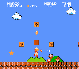
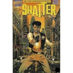
"We are now in a digital age". We sure hear that quite a bit. Comic books have passed into the era of the digital. It all started with Shatter, the first alleged computerised comic first published in March 1985. I was really surprised at the year it all began: it's close to 25 years ago, when we weren't so much considered as being in the digital age. Video games were in 8 bit on the Nintendo Entertainment System, and Supermario Bros had just been released in Japan. I've always found video games to be a good benchmark to see technological advances, especially for comic books.

Why would video games be a good benchmark? Well simply because the comic book publishing world is far from being like the Hollywood film star world. The artists are quite humble in wealth, and resources. Comic book artists, like most published authors, work with their own means, so seeing what is available to the average family in terms of technology illustrates what's available to comic book artists. In other word, it's amazing Shatter managed to get created in 1985 when we compare it to the Nintendo games of the time.


Shatter, by Peter B. Gillis and Mike Saenz, published by First Comics brags from the first issue in 1985 on the cover of being the first computerized comic. It was first published in Big K, a computer magazine which introduced Shatter as: "the world's first comics series entirely drawn on a computer" (Big K no. 6). The first look at the inside of Shatter and you can see the pixels and the computerised effects used to create it's unique touch. Mostly, what you'll discover when you open Shatter, is that the computerised style works incredibly well! It gives the whole comic a Blade Runner/Do Androids Dream of Electric Sheep? (Ridley Scott, and Philip K. Dick respectively). The artwork in Shatter brought forth the first demonstration that involving a computer in the comic book art process works. Or at least it works if you're willing to take advantage of the computer and not try to do exactly what you were doing on paper, but on a screen.

Comic book artist which I will refer too quite extensively throughout my research work, describes on his blog how he switched to working on and with a computer when working on comic books:

http://disraeli-demon.blogspot.com/2009/08/caption-2009-ten-years-in-digital-world.html

The digital age of comic books involves just a few things: a graphics tablet (now available in A5 size for about £70), Adobe Photoshop (or other similar programs) for colour work, Adobe Illustrator (or other similar programs) for the drawing and "inking", and a word processor, to put in the text and read the now digitalised scenarios. The technological advances we are getting now days for comic books don't consist of much more than bigger, better, faster and more precise graphic tablets, improved software and improved computer hardware (although nothing heavy duty is required). As home PCs and Macs get better every day, the computerisation of comic books gets simpler. Contemporary technological advances don't seem to improve the quality of comic books though because the hardware and software involved has not had breakthroughs since the democratisation of an affordable graphics tablet. The changes made in the recent software and hardware just make working on a computer ever so slightly easier, faster, and more user friendly and adaptable, as well as portable, and this is mainly because of prices. Now most homes have a printer and a scanner which can scan in a good resolution and 300dpi, and graphic tablets are affordable. Therefore, any comic artist has the tools easily available for him to take his comics into "the digital age".

Wednesday, 11 November 2009

Mixing realities

Real life has quite often been translated directly into comic books. Fluide Glaciale, a franco-belgian adult comic book magazine that has been running since 1975. One of the first adult comic publications after the amendment of:


 The law "n°49.956 of the 16 July 1949" which imposes censorship on comics which portray in any positive manner: "lying, stealing, debauchery, hatred, cowardliness, laziness, (and from 1954) ethnic prejudice" (Mouchart, B., 2003, p. 25).

Fluide Glaciale has since 1975 published comic series of pictures layed out and narrated as a comic book. As can be seen in this extract from Fluide Glaciale, Gay Friendly, Serie Or #30, 2005


Image Hosted by ImageShack.us


This medium of comics does not really work for me because of the fact that it's just "too real". Like many other entertainment media, comic books are there to take people away from their daily lifes to another person's or even to magical fantasy lands.


My vision of a cross media comic book is further from reality. Drawing via a graphic tablet on digital photos is a way of putting together comic books which is actually extremly appealing to me. Although it has to be done in a specific way: picture background and cartoon characters. I cannot bare the idea of the opposite. It has been done many times, and mainly through the 1988 famous movie Who Framed Roger Rabbit (memorable not only because of its cross media effects but also for being the only Warner Brothers and Disney collaboration). This can also be seen in the Disney classic Mary Poppins when the main characters go into a fantasy picture where all the special effects were cartoons.


I don't think anyone can compete, even nowadays, with Roger Rabbit.


My adaptation of this technique, using only Adobe Photoshop and a graphics tablet gives this:
Image Hosted by ImageShack.us


This is far from being as legendary as Roger Rabbit, but the harshness of reality against the thick clumbsy lines of my novice graphics tablet brush strokes create a contrast which is greatly inspired from Who Framed Roger Rabbit. Like the movie, this brings cartoon characters to our world, allowing us to identify with them, while keeping a safe distance with fantasy.

Monday, 9 November 2009

Telling a story

Comic books are all about telling a story. It can be seen as a mix of a graphic and written medium, but that doesn't change the purpose of the comic book being to put a narrative across. Narratives can be extremely simple, or very complicated. The comic book as a narrative medium has evolved quite a bit since "the golden age of comic" (late 1930s to late 1940s). At the time the merging between text and images was a new idea, and the textual medium would overwhelm the comic book. In the very first Judge Dredd comics for example, the authors wrote what the Judge was doing in the picture. Is it really necessary to describe the picture with text? That goes against the whole principle of comic books have text and images working hand in hand, it was more of a free for all at first.

Image Hosted by ImageShack.us
Steve Gerber & Stever Brunner, Howard the Duck #1, Marvel Comics, 1976
There is no sense to discribing the image by sense. The drawing already does the job of telling you the part of the story it illustrates. Having thought or speach bubbles or a narrator explaining what can already be observed in the artwork is redoundant.

This can be seen as a very clumsy way of using the comic book medium. As comics evolved through time, text would be less and less present and a real balance of words and pictures was established. In fact mangas like Priest would take things the other way and have entire volumes of mangas with very little text. This lead to a lot of pictures to say very few words.

Image Hosted by ImageShack.usImage Hosted by ImageShack.us


Image Hosted by ImageShack.usImage Hosted by ImageShack.us


4 consecutive pages from a French copy of:
Hyung Min-Woo, Priest, Editions Tokebi, 2004
Most of the Priest series is like these 4 pages: a lot of images, and virtualy no text. This makes for a very fast read of the volumes because there is not that much to read on each page. The pictures do not tell us much, but illustrate a almost second by second scene of Priest. This is the opposite from the Howard the Duck example, the difference is that the scarce text has a contemporary artistic justification: the author purposely wants to have no text and narrate the story only through pictures. Howard the Duck does not have that luxury because of the historical background: the medium had not been fully exploited and explored, and comic books were still very much an "underground" medium, therefore the clumsiness of the first comic book artists.

PS: Steve Gerber, if you ever read this, Howard is one of my idols and the best ever Marvel Comics superhero!

Thursday, 22 October 2009

Exploring the Random

Ok, here I am in my Masters in Design class. Started to doubt all my abilities, and especially the one that is having no abilities. I suppose everyone has self doubt, but here is how I overcame mine:

Image Hosted by ImageShack.us

So that's what goes on in my mind. I just chose to put it on paper. I like to explore this randomness in the world, the thoughts we have which don't make any sense if you're not yourself. I really enjoy reading and watching other people's extreme randomness. Weird ideas explored far enough give something like The Drinky Crow Show:


A lot of people don't seem to cope very well with people turning a corner and not really knowing why they did it. The funny part for me is that it doesn't matter, and that the consequences don't matter either. It's a kind of random comedy act. I really appreciate artists like Don Hertzfeldt which dare to do art for no apparent reason.


I admire the courage it takes for someone to create a piece of art which seems to be random. The truth is, there are no real random projects, there is always something behind it, and sometimes admitting that is hard. Admitting to myself that behind my comic strip, I was hoping to make people laugh. Drinky Crow and Don Hertzfeldt do have comedy in common but they also do have another deeper message. That message is just hard to access because one has to see through what they perceive as random.

Are random pieces of art really worth it? They seem to appeal to a minority, but mainly the rational behind them seems to be hidden under layers of what can be perceived as art without rhyme or reason, random art. The random effect of the art does make the message harder to get for some people, but for others with a twisted mind that is bored of logic, it's not just entertaining but carries a true message.

On the lighter notes, here's the wrestling bananas.
Image Hosted by ImageShack.us


Random might also just be an excuse to pass stick people, bananas, and alcoholic suicidal crows off as art. I don't think you can invade someone's mind with a very strange and obscure message that seems to be absolutely random and have amazing production values. Right?

Sunday, 11 October 2009

My Research Proposal

Here's my research proposal... I'm just hoping this isn't too ambitious. It wasn't too hard to come up with, mainly cause in second year, Andrew Jones, my broadcast journalism teacher advised us to start thinking about our dissertation subjects as soon as possible, and this was one of the ideas I had. It was hard to do as a publishing dissertation, so I just kept it asside. 


My passion is comic books, and I think it's fun to study them. In addition, this year will really allow me to explore this medium and learn through first hand experience about comic books. It is a really exciting perspective. I really want to look in to the advantages and disadvantages of using computers through the whole comic book creating process. Some authors, such as Denis Bajram (Belgium comic book scenarist and artist which did such things as UW1: Universal War 1, now published in English by Marvel comics) has done Universal War 1 only on computer, and that is based on the ex-libris of his work found in Universal War 1 number 6, in the original French version published by Soleil.


I've also thought about a comic called Sir Pyle S. Culape, about a GP for mythical beasts, that has now had 3 books published. The thing I was thinking of was that the colour artist changed during the short print run from being a person to being a studio. This seems to happen more and more. The colouring  is done mechanically  through machines. The reason I mentioned Sir Pyle S. Culape, other that it is a dreadfully cool comic, is that the first book and the third book just don't have the same feel. The third book has a fake 3D effect and a weird sheen to the colours that just don't suit the comic. I think that they tried too hard and failed. This is a limit of the computer and a victory for the good not-that-old-fashion way.


I want to experience the two extremes of purely hand drawn against purely computerised and see what can be done with  each and mainly what happens when one mixes the best of both worlds.


Individual Project Proposal

Name of student: Nicolas Rossert

Working title for your Project: How computers coloured comics

What is the topic of your proposed project?
Looking at the impact of computerisation on comic book art

What is the aim of the proposed project?
Aim: To look at the impact of computerisation on contemporary comic book art.
Objectives:
1. Look into the extent of the use of computers in the comic book design world
2. Evaluate the impact of computerisation on comic book art
3. Explore the limits of computerisation on comic books
4. Establish the advantages of cross "computerised" and "hand-drawn" comic books

What will be your approach? (Indicate how you will achieve your objectives)
-Research the existing publications containing a contemporary extensive use of computerisation on comic books
-Experiment with computerised comic books
-Evaluate the advantages of computerised comic books against those of "traditional" comics
-Bring the best parts of both worlds together and create a new type of comic book clearly distinguishing its traditional and computerised contents
-Evaluate the impact of this new technique

Give details of the context to which your project relates:
Comic books are becoming more and more extensively computerised. Now some comics are made entirely on computer, from the sketching to the colourisation. This technique of comic book creation has divided the realm of comic book art. Some see this as a clear advantage and mainly as giving possibilities of extremely rapid and precise one man comic book creations. The world stays divided because most feel that comics created or just coloured on computer do not have the same feel as hand-drawn and coloured comics. It has now become the norm to have computer coloured comics, and a computerised colouring studio's name as colourist on the comic book instead of a name of a one artist. This has led the comic book creation to go through a more and more industrialised production process. This research would like to evaluate not only the impact of the overwhelming computerised world, but also gage how the analogue can mix with the digital in comic book creation. 

Outputs
-Entirely digital comic books
-Entirely hand-drawn comic books
-Experimental methods of both digital and hand-drawn comic book creation
-Merging of the two possible styles

What resources will you need?
-Comic books
-Comic book research litterature
-Computer with scanner and printer
-"Traditional" (analogue) drawing tools
-Other art utensils

Plan of Work (Indicate approximate time required to complete key tasks)
Semester 1 Explore digital comic books
Semester 2 Compare and contrast the 2 comic book creation techniques
Semester 3 Explore the mix of the two techniques