Iain asked me "why do you put the email address on the bottom of some of your comics?" My answer is simple: when I write a comic about someone else I send them a copy of the comic, and just in case I write down the link to my website if they want to check things out.
The other reason I put the address of the website on the comics is when I make promotional posters. I put the address of the website on my comics cause it can be used as a promotional stunt, but mainly it's a form a signature.
Why am I explaining this now? Well for the first time I actually got an answer from someone I didn't meet in person, and of quite high profile. My comic #100 on my website is about the Church of the Flying Spaghetti Monster, so I sent a copy to the creator of the church and got a reply. That was good enough to put a grin on my face, knowing that someone liked what I did and thought it to be topical. Bobby, the creator of the church thanked me for my contribution and said he would put the comic up on the church's website.
http://www.venganza.org/ - Church's Site
What is the Church of the Flying Spaghetti Monster? Well I do admit it is a bit of an intellectual underground movement, but I'll fill you in. In America, in the state of Kansas, home of Dorothy from the Wizard of Oz, a law passed: they had to put a sticker in front of biology books saying that evolution is just a theory and were bound to teach creationism as the other explanation of life on Earth... So as a reply to this, Bobby decided he would present the school-board with his explanation of life on earth, and to cut it short, he believes in a flying spaghetti monster. If the creationism gets into science, well then he should get to dress up like a pirate, right? It's a religious thing in the church of the Flying Spaghetti Monster.
Friday, 30 April 2010

Tuesday, 30 March 2010
Orc Stain - Colours, design, and creativity,
Orc Stain is a new comic from Image Comics, probably the biggest "independent" comic book company there is. The first issue was released last month, and there's only one man behind it: James Stokoe. He created, wrote, drew and coloured Orc Stain. There's a theory amongst comic book artists that one man crews do a better job at creating comics than the classic writer/artist duo. The theory comes from quite a long series of examples, like Chris Ware, Daniel Clowes, Denis Bajram, and Eric Hérenguel, just to name a few. The idea is that when you work alone, there's no comprise to be had with the creative idea behind the comic book, but that seems to be a debate that has been going on for as long as "art" has been around.
Moving on from this one man crew system, Orc Stain is without a doubt in my mind the most creative American comic book released this year. I am trying not to get too caught up in my enthusiasm about this comic book. To be fair I did wait until issue 2.
Orc Stain is full of colour, the shades are incredible, and the design of every single creature and scene in this comic is absolutely amazing and represent a source of creativity which I have rarely seen in American comic books. The fact is that, by "tradition" most creative and experimental comic books have been European. American comics are still under the influence of DC and Marvel Comics. Paul Gravett, comic book publisher, curator, artist, and critic talks about this overwhelming reign of influence of Marvel and DC as a very negative movement and influence in the comic book world. The American comic book world is extremely oriented around superheroes. The industry is so caught up in the superhero business, especially with Hollywood buying all the superhero films rights. So much so that non-superhero American comics have become rare.
"Why is Orc Stain so special?" might you ask. In this comic, in addition to the design and colour work James Stokoe brilliantly created, there is a brand new imaginative world with an original story, great characters, and overall a comic that knocks down all boundaries. A one-eyed orc safe cracker as a main character is brilliantly imaginative, especially when you learn that the safes are big bear-like creatures with an ancient safe-lock system on there stomach. Need I say more?


Moving on from this one man crew system, Orc Stain is without a doubt in my mind the most creative American comic book released this year. I am trying not to get too caught up in my enthusiasm about this comic book. To be fair I did wait until issue 2.
Orc Stain is full of colour, the shades are incredible, and the design of every single creature and scene in this comic is absolutely amazing and represent a source of creativity which I have rarely seen in American comic books. The fact is that, by "tradition" most creative and experimental comic books have been European. American comics are still under the influence of DC and Marvel Comics. Paul Gravett, comic book publisher, curator, artist, and critic talks about this overwhelming reign of influence of Marvel and DC as a very negative movement and influence in the comic book world. The American comic book world is extremely oriented around superheroes. The industry is so caught up in the superhero business, especially with Hollywood buying all the superhero films rights. So much so that non-superhero American comics have become rare.
"Why is Orc Stain so special?" might you ask. In this comic, in addition to the design and colour work James Stokoe brilliantly created, there is a brand new imaginative world with an original story, great characters, and overall a comic that knocks down all boundaries. A one-eyed orc safe cracker as a main character is brilliantly imaginative, especially when you learn that the safes are big bear-like creatures with an ancient safe-lock system on there stomach. Need I say more?


Monday, 22 March 2010
Simply genius comic book design
I don't know how many people know the Moomins, but I just got my hands on a beautiful edition of the English translation of the original comics. This comic was started in 1945, and went on until 1993, and the design of the comic is absolutely genius.
 Tove Jansson created in the Moomin comic book amazing designs and comic book flow. The use of the hose as the frame of the comic and making it lead in such a clever way from square to square it a beautiful design method allowing for a smooth flow of the story and the artwork across the page. The detail of the details create a very playful design and flow that all can appreciate.
On further extremely good design, a young artist from Brighton comes to mind: Hannah Berry. I often think of her when I am designing my own comics and thinking about the narrative flow and boundaries of my comics.

In the opening page of Britten & Brülightly, by Hannah Berry, nominated this year for the grand prize of Angoulème comic book festival, one can see a comic book page with no traditional block boundaries between the action in the comic. The text is not in speech or though bubbles, the images create their own boundaries and the flow of time is expressed in the simplest way. The simplicity of the narration flow comes through the balance of the artwork and the storytelling, allowing for the images to flow naturally and the story to be told in an original and artistic manner. Hannah Berry, as I do, uses white space to separate the the frames of the comic book and lets the natural boundaries of the images be self sufficient. The narration through images comes so naturally that one is instantly drawn into the comic book.

On further extremely good design, a young artist from Brighton comes to mind: Hannah Berry. I often think of her when I am designing my own comics and thinking about the narrative flow and boundaries of my comics.

In the opening page of Britten & Brülightly, by Hannah Berry, nominated this year for the grand prize of Angoulème comic book festival, one can see a comic book page with no traditional block boundaries between the action in the comic. The text is not in speech or though bubbles, the images create their own boundaries and the flow of time is expressed in the simplest way. The simplicity of the narration flow comes through the balance of the artwork and the storytelling, allowing for the images to flow naturally and the story to be told in an original and artistic manner. Hannah Berry, as I do, uses white space to separate the the frames of the comic book and lets the natural boundaries of the images be self sufficient. The narration through images comes so naturally that one is instantly drawn into the comic book.
My "other work" page on my website and digital solutions
After the talking last Monday I took the leap and edited my website's design. I added 2 buttons on the main menu bar: one is my website email address, and the other is an "other work" button. I've added a page where I introduced my digital work and have posted 3 digital images so far.
I've been working quite a bit on my digital comics, and have been having a hard time merging the different pieces of the story together. I've tried simple uni-colour background, painting with a digital brush on the back, photo-album-like frames, lines which go with the pictures, and many many other attempts that simply did not work at all.
While reading Haunt #5, by Todd McFarlen and Greg Capullo, the men behind Spawn, and I came upon this:

It's a simple sequence of 3 squares, but they have no borders and are linked together so perfectly with the background. This comic doesn't have photographies like the digital ones I do, but it gave me the inspiration I needed to blend squares of my own digital comics together: make the background photo merge into a blurred colour related to the picture and interlink those with the other squares. My main problem with the digital comics is the redundancy of the link I use in the comics, but with this technique, every comic would be unique due to unique colours in the photographies.
I've been working quite a bit on my digital comics, and have been having a hard time merging the different pieces of the story together. I've tried simple uni-colour background, painting with a digital brush on the back, photo-album-like frames, lines which go with the pictures, and many many other attempts that simply did not work at all.
While reading Haunt #5, by Todd McFarlen and Greg Capullo, the men behind Spawn, and I came upon this:

It's a simple sequence of 3 squares, but they have no borders and are linked together so perfectly with the background. This comic doesn't have photographies like the digital ones I do, but it gave me the inspiration I needed to blend squares of my own digital comics together: make the background photo merge into a blurred colour related to the picture and interlink those with the other squares. My main problem with the digital comics is the redundancy of the link I use in the comics, but with this technique, every comic would be unique due to unique colours in the photographies.
Wednesday, 17 March 2010
Second Plans for the Live Stick
Here are my second plans for the live stickman statue. After the group presentation and a couple comments by Matt and Mark, I decided to work on a more pose-able statue, a bit like a giant action figure (to avoid using the word "doll"). The statue would be more versatile and could have many many scenario uses, and would allow to take the statue to more public places.
There are quite a few logistical problems, but I have also come up with solutions. First of, I think the articulation is quite simple, although it would be nice to have a rotation in the upper arm of the statue, allowing for more diverse poses. A screw mechanism for the arm rotation needs more research in the "technology", or should I say by a few visits to the hardware store.
As good news, the whiteboard option is really simple: rolls of disposable whiteboard are available for about £20 for 25. This will allow for a very easy creation of the speech bubble, and my new addition, a whiteboard face!
I plan to use whiteboard for the face of the stickman in order to be able to modify his facial expression, once again to allow for much more manoeuvrability.

There are quite a few logistical problems, but I have also come up with solutions. First of, I think the articulation is quite simple, although it would be nice to have a rotation in the upper arm of the statue, allowing for more diverse poses. A screw mechanism for the arm rotation needs more research in the "technology", or should I say by a few visits to the hardware store.
As good news, the whiteboard option is really simple: rolls of disposable whiteboard are available for about £20 for 25. This will allow for a very easy creation of the speech bubble, and my new addition, a whiteboard face!
I plan to use whiteboard for the face of the stickman in order to be able to modify his facial expression, once again to allow for much more manoeuvrability.

Friday, 12 March 2010
Sketches for the stickman statue
As said before, I have spent quite a long time thinking through the logistics of creating this stickman statue and here are my sketches for the creation of it.


Thursday, 11 March 2010
Prototyping prototypes
I have two research ideas that I working on. They are both in the same ideal of taking the comic book out of the page and into the real world. As I have explained earlier, I see this as the "analog" version of the webcomic. I started spray painting comics on the wall of a squat/old train shed, but it recently got fire-bombed. A trajic accident not for the artwork on the wall or the collection of garbage and rusted circular saws in the shed, but because of my neighbor's race-pigeon housing being the intended target...
Anyways, the outer walls of the shed I started "publishing" comics on is now black from the fire damage, which gives me an entire new clean-ish surface to work with. I plan on making a wall painting with stickmen as close to life-size as practically and safely possible.
Here is the script for the 1 square wall-painted comic I want to do:
Robber stickman with knife and mask mugs another stickman. He stand on the left of the scene for faster reading purposes (as I have mentioned before in other blog posts, we read English from left to right and top to bottom, therefore for faster readability of the comic the text and images should be situated logically from left to right and top to bottom). The mugged stickman stands on the right looking into his hand.
Mugger: "The money or your life!"
Mugger victim: "I'll meet you half ways. Call it £3.42"
Extremely simple scenario which brings incredibly light humor into a publicly accessible spray painted artwork. The piece will be free to see to all that pass by, making a free self-published "analog" comic.
I tend to spend a lot of time on logistical problems so I am sure everything is executed in a quick and efficient manner. I have achieved a satisfying plan of making a huge stencil with the biggest piece of paper/card I could afford. I will make a giant solid stencil out of it. In fact 3 stencils: 1 for each character and 1 for the text. I am now on the way of thinking on how to create in the most precise manner this stencil. I first thought of drawing it myself on A1 paper. I do foresee the drawing as problematic, not being anywhere used to drawing on such a huge scale, but my main concern lies with the cutting out. All in all, my colleague Mark Rae said to me yesterday that if it where him, he would do it through computers. I think that it is the best solution, especially considering that I need a vectorial program drawn image to have it cut out by a computer and I just so happen to exclusively draw computerised stickmen through Adobe Illustrator which just so happens to be a vectorial program. I plan to use this to create my stencil.
I now have to design the comic on illustrator and experiment with the best stencil techniques to create a clean and functioning giant stencil.
My second project I am also prototyping for alter is the creation of a stickman statue with a white-board/dry eraser board located in the speech bubble. This would allow for the public to add their own story and text to the statue of the stickman, and create an simple, free and playful/recreational publicly accessible comic book creator. On the internet there a dime-a-dozen free Flash programs to create and design your own comics through pre-made artwork and speech bubble tools. This would be a less elaborate and simpler "analog" alternative, bringing the Flash comic book programs to the public.
This would be a participatory and performance-like public project. Although to do this, I have to create the statue, and as for the stencil I like to plan ahead and have a clear and precise plan. The create the statue I need to choose material: re-bar or metal would be my first choice as an aesthetically and tactilely pleasing material to create a stickman out of. In addition to that, welding a speech bubble onto it would be easier and have a high production value statue feel to it. Although this would be a good approach for someone with the time and resources which I dunno posses, I find it would also be very hard to transport and impractical, therefore removing the option of a more mobile statue.
Like the stencil, I foresee myself creating the statue in 2 to 3 pieces from wood carved/shaped through a computer based vectorial program. This creation would be completely 3 dimensional and I am quite new to the creation process therefore more research on that part of the production is needed. A part from that, I have thought about the shape/form of the statue and mainly the way it would be part together: a base, a stickman and a speech bubbly made from wood and spray painted black matt or semi-gloss. The material are cheaper and lighter than metal and allow for much for manoeuvrability. In addition to this the stand would be relatively cheap to create as well as stable. For the stickman, carving him from one solid piece of wood might not only be problematic but also impractical. Therefore he could be divided into 2 pieces at the mid-section. A bolt could be placed inside the body of the stickman allowing for an easy way of putting the piece together as well as making it more transportable.
My main logistical problem for choosing wood as a material of choice is the speech bubble which would need a very solid support, therefore the positioning of it has to be carefully thought through for safety and stability reasons, and to create a solid enough speech bubble that has enough support from the main statue piece. It could be detachable and connectible through a bolt to the main piece. The centre of the speech bubble would be a modified whiteboard shaped as needed, and allowing the public to easily add their text to the scene, allowing them to add their own input to the life comic book scene.
Illustration and plans are still to be finished.
Anyways, the outer walls of the shed I started "publishing" comics on is now black from the fire damage, which gives me an entire new clean-ish surface to work with. I plan on making a wall painting with stickmen as close to life-size as practically and safely possible.
Here is the script for the 1 square wall-painted comic I want to do:
Robber stickman with knife and mask mugs another stickman. He stand on the left of the scene for faster reading purposes (as I have mentioned before in other blog posts, we read English from left to right and top to bottom, therefore for faster readability of the comic the text and images should be situated logically from left to right and top to bottom). The mugged stickman stands on the right looking into his hand.
Mugger: "The money or your life!"
Mugger victim: "I'll meet you half ways. Call it £3.42"
Extremely simple scenario which brings incredibly light humor into a publicly accessible spray painted artwork. The piece will be free to see to all that pass by, making a free self-published "analog" comic.
I tend to spend a lot of time on logistical problems so I am sure everything is executed in a quick and efficient manner. I have achieved a satisfying plan of making a huge stencil with the biggest piece of paper/card I could afford. I will make a giant solid stencil out of it. In fact 3 stencils: 1 for each character and 1 for the text. I am now on the way of thinking on how to create in the most precise manner this stencil. I first thought of drawing it myself on A1 paper. I do foresee the drawing as problematic, not being anywhere used to drawing on such a huge scale, but my main concern lies with the cutting out. All in all, my colleague Mark Rae said to me yesterday that if it where him, he would do it through computers. I think that it is the best solution, especially considering that I need a vectorial program drawn image to have it cut out by a computer and I just so happen to exclusively draw computerised stickmen through Adobe Illustrator which just so happens to be a vectorial program. I plan to use this to create my stencil.
I now have to design the comic on illustrator and experiment with the best stencil techniques to create a clean and functioning giant stencil.
My second project I am also prototyping for alter is the creation of a stickman statue with a white-board/dry eraser board located in the speech bubble. This would allow for the public to add their own story and text to the statue of the stickman, and create an simple, free and playful/recreational publicly accessible comic book creator. On the internet there a dime-a-dozen free Flash programs to create and design your own comics through pre-made artwork and speech bubble tools. This would be a less elaborate and simpler "analog" alternative, bringing the Flash comic book programs to the public.
This would be a participatory and performance-like public project. Although to do this, I have to create the statue, and as for the stencil I like to plan ahead and have a clear and precise plan. The create the statue I need to choose material: re-bar or metal would be my first choice as an aesthetically and tactilely pleasing material to create a stickman out of. In addition to that, welding a speech bubble onto it would be easier and have a high production value statue feel to it. Although this would be a good approach for someone with the time and resources which I dunno posses, I find it would also be very hard to transport and impractical, therefore removing the option of a more mobile statue.
Like the stencil, I foresee myself creating the statue in 2 to 3 pieces from wood carved/shaped through a computer based vectorial program. This creation would be completely 3 dimensional and I am quite new to the creation process therefore more research on that part of the production is needed. A part from that, I have thought about the shape/form of the statue and mainly the way it would be part together: a base, a stickman and a speech bubbly made from wood and spray painted black matt or semi-gloss. The material are cheaper and lighter than metal and allow for much for manoeuvrability. In addition to this the stand would be relatively cheap to create as well as stable. For the stickman, carving him from one solid piece of wood might not only be problematic but also impractical. Therefore he could be divided into 2 pieces at the mid-section. A bolt could be placed inside the body of the stickman allowing for an easy way of putting the piece together as well as making it more transportable.
My main logistical problem for choosing wood as a material of choice is the speech bubble which would need a very solid support, therefore the positioning of it has to be carefully thought through for safety and stability reasons, and to create a solid enough speech bubble that has enough support from the main statue piece. It could be detachable and connectible through a bolt to the main piece. The centre of the speech bubble would be a modified whiteboard shaped as needed, and allowing the public to easily add their text to the scene, allowing them to add their own input to the life comic book scene.
Illustration and plans are still to be finished.
Tuesday, 9 March 2010
Self critic in my work
I never really realised until recently that I did quite a lot of self-critic of my work in my work. I didn't realise this because I did most of these self critic comics to express my insecurities about my work. It's also my way of being honest and saying "I'm no artist, but Hell, I'll keep doing this until someone stops me." Apart from my deep sense of insecurity, I like admitting most of my work is poor on an artistic scale, mainly because I'm aiming to explore the design perspective of comic books and not become a comic book artist.
I don't know why, but honesty about my work seems to drive me forward. For me, being honest and constantly criticising my work allows me to move forward and mainly not to become one of those artists I despise so much because they have lost all links with reality. I've been very inspired by the philosophy of Harvey Pekar and Robert Crumb, especially their work in American Splendor. "Bob and Harv" constantly critic not only their lives but also their work and life and even author/artist relationship.
 American Splendor cover with Robert Crumb and Harvey Pekar discussing record trades, both being jazz and blues record collectors.
 One of my first insecurities and main critics is my simple use of stickmen. I have to admit that I have evolved and widened the array of expression of my stickmen, but it took Jean Louis Mourrier four volumes of Trolls de Troy to draw trolls the way they look now.

 As it can be seen on the cover, every artist's style evolves with time. Mourrier admitted his style evolved and has compared his trolls to Tarquin's original trolls from Lanfeust de Troy. I met Mourrier twice at the Angoulème 2009 festival and asked him about the evolution of his style. He said that the more you work on your character design, the more they fall into shape naturally.
Stickmen comics have become more and more natural, especially the one I have done from a graphics tablet.
I have made comments on every aspect of my work, from the format of the paper, to the pickles from outer-space and different details in stickmen as well as my general narration methods.


I don't know why, but honesty about my work seems to drive me forward. For me, being honest and constantly criticising my work allows me to move forward and mainly not to become one of those artists I despise so much because they have lost all links with reality. I've been very inspired by the philosophy of Harvey Pekar and Robert Crumb, especially their work in American Splendor. "Bob and Harv" constantly critic not only their lives but also their work and life and even author/artist relationship.


Stickmen comics have become more and more natural, especially the one I have done from a graphics tablet.
I have made comments on every aspect of my work, from the format of the paper, to the pickles from outer-space and different details in stickmen as well as my general narration methods.


Wednesday, 3 March 2010
http://www.stickmencomics.com
I started my very own webcomic. I decided, on the 3rd of January, that I would get some webspace and expand from my research oriented blog and publish my comics to the public. One month later, it was live. Now, it's all set up and running fine.
First of all, I had the idea that for the website's design to hand-draw the whole website. I do have a few words typed in, but it was mostly in case someone couldn't read my handwriting. The website is simple. That's all I wanted, simplicity and with a sensation of the website being an odd mix of hand drawn design on a purely digital publishing medium. I really like that contrast of digital perfectly solid black line and the pen drawn "black" line which had the waves, strengths, weaknesses, and swerves of black ink, being so perfectly imperfect.
The website is constructed on the basic webcomic template after studying other webcomic website designs. The main inspiration in its simplicity was XKCD. Although my website has very specific originalities which can easily be overlooked but has great impact on the actual content, impact and delivery of the webcomics. The website has only 3 pages: home (where the comic browser is), archives (to find speicific comics) and info (where I briefly explain what I am doing and leave my author's email - fnic@stickmencomics.com). The main impact of the website design on the comics is the home page on which I allocated a browser space which has a width of 595 pixels. It just happens I chose that width because it is the pixel equivalent width of A4 paper. Added to that, the only design "perk" I added to my website were the sidebars which impose a certain height for the browser. All in all, I purposely limited my publishing area for my comic books to A4 or "letter" size comics. Most of the webcomics I have viewed have their own self-imposed format, although largely favoured layout is in "strip" format, or landscape.
The technical difficulty is the viewer has to scroll down to see the whole comic. It has up sides and down sides. The main up side is that the down side of the comic isn't visible. This allows for an effective delivery of the punchline. That is a worry because the text is as important of as the art. Therefore it is important to get the viewer to read the last part of the comic last. On the really down side is that on a small screen, say a 15" with 800x600 resolution, the whole website isn't visible. I considered that, then I thought: "people who still use those screens are: 1/at work, 2/ using a very old home computer screen". Therefore I decided to continue with my project the way it was thinking that demographic of readers wouldn't exactly be those who read my webcomics.
The archive cause me a bit of grief. It was the hardest decision to take, not because of technical advise but mainly because of design practicalities and layout. The archive has to make it easy for one to find a specific webcomic quickly, which also keeping loading time into consideration. Flash could have done the job but now more and more security systems block flash. Thumbnails would have been too network heavy, and a browser would have the process too long. Thus my choice of a unique list, as used on XKCD, but organised and laid out in a more specific and user friendly way. My only question that remains is: "should I keep the sidebars and if so, should I impose a heigh limit on the table enabling a scroll bar on inside the actual archive?". I still have not made up my mind.
My webcomics can be found on my website: http://www.stickmencomics.com
First of all, I had the idea that for the website's design to hand-draw the whole website. I do have a few words typed in, but it was mostly in case someone couldn't read my handwriting. The website is simple. That's all I wanted, simplicity and with a sensation of the website being an odd mix of hand drawn design on a purely digital publishing medium. I really like that contrast of digital perfectly solid black line and the pen drawn "black" line which had the waves, strengths, weaknesses, and swerves of black ink, being so perfectly imperfect.
The website is constructed on the basic webcomic template after studying other webcomic website designs. The main inspiration in its simplicity was XKCD. Although my website has very specific originalities which can easily be overlooked but has great impact on the actual content, impact and delivery of the webcomics. The website has only 3 pages: home (where the comic browser is), archives (to find speicific comics) and info (where I briefly explain what I am doing and leave my author's email - fnic@stickmencomics.com). The main impact of the website design on the comics is the home page on which I allocated a browser space which has a width of 595 pixels. It just happens I chose that width because it is the pixel equivalent width of A4 paper. Added to that, the only design "perk" I added to my website were the sidebars which impose a certain height for the browser. All in all, I purposely limited my publishing area for my comic books to A4 or "letter" size comics. Most of the webcomics I have viewed have their own self-imposed format, although largely favoured layout is in "strip" format, or landscape.
The technical difficulty is the viewer has to scroll down to see the whole comic. It has up sides and down sides. The main up side is that the down side of the comic isn't visible. This allows for an effective delivery of the punchline. That is a worry because the text is as important of as the art. Therefore it is important to get the viewer to read the last part of the comic last. On the really down side is that on a small screen, say a 15" with 800x600 resolution, the whole website isn't visible. I considered that, then I thought: "people who still use those screens are: 1/at work, 2/ using a very old home computer screen". Therefore I decided to continue with my project the way it was thinking that demographic of readers wouldn't exactly be those who read my webcomics.
The archive cause me a bit of grief. It was the hardest decision to take, not because of technical advise but mainly because of design practicalities and layout. The archive has to make it easy for one to find a specific webcomic quickly, which also keeping loading time into consideration. Flash could have done the job but now more and more security systems block flash. Thumbnails would have been too network heavy, and a browser would have the process too long. Thus my choice of a unique list, as used on XKCD, but organised and laid out in a more specific and user friendly way. My only question that remains is: "should I keep the sidebars and if so, should I impose a heigh limit on the table enabling a scroll bar on inside the actual archive?". I still have not made up my mind.
My webcomics can be found on my website: http://www.stickmencomics.com
Thursday, 25 February 2010
Application to "WHAAM!" residency
I recently spent quite a bit of time working on a residency proposal for a comic book residency opportunity. Outside the pay of £3,000 plus expenses for a 3 week job, applying was a good experience in itself. Being a very new art practitioner, I had never done this type of application, and it has been over 5 years since the last comic book competition I participated in. So this was quite a lot of work, and I was sure I wouldn't get a place, although I gave my application 100% of my capacities. I think it's not a bad application for a first try.
I did pass the textual 350 word limited written proposition onto a few other eyes and tried to get as much feedback as possible. I worked the most on this part of the proposition, refining every word and developing the 350 words to the full literary capacity my underdeveloped writing skills.
The main trouble of this proposition was only 3 images could be submitted with the proposition. I constructed my proposition around comic book design, mainly applied to digital comics. Therefore I had to submit artwork that reflected the ideas in the textual proposition. 3 was a horrible number, I could've done 2 or 4 seeing as I mainly work in 2 styles. So "which style should I choose for the 3rd piece of art?" was my main trouble. I decided for another digital comic done on computer because it probably fitted slightly better into the whole proposition.
After one email saying they were reviewing my proposition, and a second one saying they had quite a lot of proposals to go through, I finally got one rejecting my proposition.
Please find the proposition here:
For this firstsite residency I would like to consider comic book design and its essential role in comic book narration. My intention is to bring to the residency opportunity various methods of comic book designs and how they can enhance story-telling and demonstrate that design is an integral part for effective comic book narration. Within the scope of "comic book design" I am looking forward to the opportunity to be able to work with various artists and authors to draw more attention towards grids, page layout, functionality, and overall harmony between text, images and story-telling.
The scope of activity including design would involve considering the overlooked importance of design in comic books, and webcomics. This would involve workshops in which the public could tell different stories and layout stories in various ways by using cut out speech and thought bubbles and combining with comic book artwork in order to create various layouts, grids and designs to tell different stories or to explore the many possibilities of comic book design and its impact on narration. In order to do this I also have specific authors I would like to view the project alongside the work of artists such as Chris Ware, Hannah Berry, D'Israeli, Harvey Pekar as well as French comics and comic book authors such as Enki Bilal and Winshluss, and refer to webcomics such as Cyanide & Happiness, XKCD, and White Ninja to illustrate online web design.
On a more specific note, I would like to bring forward the importance of design in webcomics, the new era of self-published comics. Webcomics have allowed the birth of comics based solely on simple design, simple layouts, simple story-telling and simple artwork; but in order for these webcomics to be effective comic book medium, they need to emphasise on design and story-telling, to compensate for amateur artwork. Thus webcomic artwork does not push forward excellent artwork but charm, and intuitive and logical design. Looking at this new era of digital and computerised comics would allow analysis and evaluation of the strict impact of sole design and simplicity on the comic book world.
And here are the 3 images that went with the proposal:
 This comics is very reflective... but as the following one illustrates, that is what I do... Yes. No secret, I write about what happens to me, and by submitting this I thought I put my cards on the table.


I did pass the textual 350 word limited written proposition onto a few other eyes and tried to get as much feedback as possible. I worked the most on this part of the proposition, refining every word and developing the 350 words to the full literary capacity my underdeveloped writing skills.
The main trouble of this proposition was only 3 images could be submitted with the proposition. I constructed my proposition around comic book design, mainly applied to digital comics. Therefore I had to submit artwork that reflected the ideas in the textual proposition. 3 was a horrible number, I could've done 2 or 4 seeing as I mainly work in 2 styles. So "which style should I choose for the 3rd piece of art?" was my main trouble. I decided for another digital comic done on computer because it probably fitted slightly better into the whole proposition.
After one email saying they were reviewing my proposition, and a second one saying they had quite a lot of proposals to go through, I finally got one rejecting my proposition.
Please find the proposition here:
For this firstsite residency I would like to consider comic book design and its essential role in comic book narration. My intention is to bring to the residency opportunity various methods of comic book designs and how they can enhance story-telling and demonstrate that design is an integral part for effective comic book narration. Within the scope of "comic book design" I am looking forward to the opportunity to be able to work with various artists and authors to draw more attention towards grids, page layout, functionality, and overall harmony between text, images and story-telling.
The scope of activity including design would involve considering the overlooked importance of design in comic books, and webcomics. This would involve workshops in which the public could tell different stories and layout stories in various ways by using cut out speech and thought bubbles and combining with comic book artwork in order to create various layouts, grids and designs to tell different stories or to explore the many possibilities of comic book design and its impact on narration. In order to do this I also have specific authors I would like to view the project alongside the work of artists such as Chris Ware, Hannah Berry, D'Israeli, Harvey Pekar as well as French comics and comic book authors such as Enki Bilal and Winshluss, and refer to webcomics such as Cyanide & Happiness, XKCD, and White Ninja to illustrate online web design.
On a more specific note, I would like to bring forward the importance of design in webcomics, the new era of self-published comics. Webcomics have allowed the birth of comics based solely on simple design, simple layouts, simple story-telling and simple artwork; but in order for these webcomics to be effective comic book medium, they need to emphasise on design and story-telling, to compensate for amateur artwork. Thus webcomic artwork does not push forward excellent artwork but charm, and intuitive and logical design. Looking at this new era of digital and computerised comics would allow analysis and evaluation of the strict impact of sole design and simplicity on the comic book world.
And here are the 3 images that went with the proposal:


Sunday, 10 January 2010
Dragging people into my world
Today I made a comic I was planning to do since I got my new comic sketch book. The world inside the comic book can seem so distant a foreign. For some this is comforting, but for those who like the world inside the comic book and like to escape inside the comic book. Breaking the barrier in between comic book and reality is most enjoyable, and allows a more intimate relationship in between author and reader. This techniques has been used since the very beginning of cartoon art:
From 1920s Tex Avery cartoons:

To Who Framed Roger Rabbit:
To flash animation of Animation Vs Animator:
I started doing the same cross-over inspired by the works forth-mentioned. I wanted to blur the line in between real and cartoon. I felt that this work make my characters more three dimensional and allowed them to pop out of the page and jump into reality.


From 1920s Tex Avery cartoons:

To Who Framed Roger Rabbit:
To flash animation of Animation Vs Animator:
I started doing the same cross-over inspired by the works forth-mentioned. I wanted to blur the line in between real and cartoon. I felt that this work make my characters more three dimensional and allowed them to pop out of the page and jump into reality.


Thursday, 7 January 2010
My comic book creation process
When I create comic books, I have to say that I don't always know how things are going to turn out. I generally have an idea about a subject, or I just think of something I'd like to comment on and then there can be 1 of 2 ways I go from there:
1. I put pen to paper straight away and improvise everything: I make up the text as I go along and the drawing, and try to do the most logical and intuitive layout design. I cannot say I truly improvise everything, I simply start at the top left, just thinking about what space I need for the text, and then every new item laid out on the page is created considering what has come before, but not thinking about what will be coming next. These designs are generally the simplest and have an easier less calculated flow.
2. The premeditated comic book design is not the simplest, especially now that I'm working on letter format paper, and not A4. The designs born from this are very calculated: everything has its place and have been positioned in many different places before pen is put to paper. All be it, I don't do a physical draft of my comic book designs, I do everything in mentally, picturing how things would look in different places and how the design and layout can enhance the story, or how I can maximise the impact with a calculated and thought through design.

The saying "read if you want to write" works very well with comic design. After reading comics, the logic of design appears and the "rules and exceptions" of the logic of telling a comic book story seems to become second nature. Most of it is based on the easy logic that we read text right to left and top to bottom, so that's how a comic book is designed to be read, each part of the comic being like a different paragraph. The notorious exception to this deign logic involves putting arrows leading from one square to the next ordering the squares out of their natural reading chronology and guiding the reader. I have done all I can to avoid doing so; I like to work with the layout and design and make them so simple and logic that their cannot be ambiguity on where to read next, and therefore no need for arrows.

The tools I use for the simple black and white comic designs are simple: paper and black ink fountain pens. Nothing is brought through the computer. Making everything by hand stops making comics using ctrl+c and ctrl+v (copy and pasting). Comic books like Cyanide and Happiness tend to just copy and paste every character and their body parts onto each different comic. By doing so the comic book loses personality, clumsiness, and ultimately charm. Webcomics are not renown for the artistic prowess in their execution, they mainly play on good and simple design, and charm and character. I cannot deny that in my case charm and character means mistakes and imperfect lines.
My wokstation:

1. I put pen to paper straight away and improvise everything: I make up the text as I go along and the drawing, and try to do the most logical and intuitive layout design. I cannot say I truly improvise everything, I simply start at the top left, just thinking about what space I need for the text, and then every new item laid out on the page is created considering what has come before, but not thinking about what will be coming next. These designs are generally the simplest and have an easier less calculated flow.
2. The premeditated comic book design is not the simplest, especially now that I'm working on letter format paper, and not A4. The designs born from this are very calculated: everything has its place and have been positioned in many different places before pen is put to paper. All be it, I don't do a physical draft of my comic book designs, I do everything in mentally, picturing how things would look in different places and how the design and layout can enhance the story, or how I can maximise the impact with a calculated and thought through design.

The saying "read if you want to write" works very well with comic design. After reading comics, the logic of design appears and the "rules and exceptions" of the logic of telling a comic book story seems to become second nature. Most of it is based on the easy logic that we read text right to left and top to bottom, so that's how a comic book is designed to be read, each part of the comic being like a different paragraph. The notorious exception to this deign logic involves putting arrows leading from one square to the next ordering the squares out of their natural reading chronology and guiding the reader. I have done all I can to avoid doing so; I like to work with the layout and design and make them so simple and logic that their cannot be ambiguity on where to read next, and therefore no need for arrows.

The tools I use for the simple black and white comic designs are simple: paper and black ink fountain pens. Nothing is brought through the computer. Making everything by hand stops making comics using ctrl+c and ctrl+v (copy and pasting). Comic books like Cyanide and Happiness tend to just copy and paste every character and their body parts onto each different comic. By doing so the comic book loses personality, clumsiness, and ultimately charm. Webcomics are not renown for the artistic prowess in their execution, they mainly play on good and simple design, and charm and character. I cannot deny that in my case charm and character means mistakes and imperfect lines.
My wokstation:

Sunday, 3 January 2010
A Blog has the same reading paradox as a manga!
When I was showing my work from my blog, someone said something interesting: "the problem with blogs is that they're the wrong way around". Actually, in the design logic, it isn't. When the readers open a blog, they get to see the latest news/post from the blog. That's one problem: if you're a follower from the start of the blog it's ok, because you get straight to what you want, but if you're new to this, you don't want to start reading the blog from the end? But this is just a design choice favouring the devoted followers of a blog over the new arrivals.
My analogy with mangas comes from the design choice forth-mentioned. The paradox is this: we read from left to right, and top to bottom, but blogs display their texts left to right and top to bottom, but the order of the posts are chronologically ordered bottom to top! So you have to read the post top to bottom, but go back on top to read the next post.
Where do mangas come in you might ask? Well it's simple: Japanese read right from left... And there comes the design decision when adapting a manga say into English: do we invert the picture allowing everything to flow left to right/top to bottom but have the characters left and right swapped around (swapping the image around on the vertical axis). Or! Do we leave the picture as it was originaly, but creating a new rule of reading: the text is read left to right, but the images are read right to left... Most choose the latter.

Design. It makes us have to choose. It demands logic, and in this case a decision of what to put first.
To the left: a "how to read" guide found before page 1 of some mangas.
My analogy with mangas comes from the design choice forth-mentioned. The paradox is this: we read from left to right, and top to bottom, but blogs display their texts left to right and top to bottom, but the order of the posts are chronologically ordered bottom to top! So you have to read the post top to bottom, but go back on top to read the next post.
Where do mangas come in you might ask? Well it's simple: Japanese read right from left... And there comes the design decision when adapting a manga say into English: do we invert the picture allowing everything to flow left to right/top to bottom but have the characters left and right swapped around (swapping the image around on the vertical axis). Or! Do we leave the picture as it was originaly, but creating a new rule of reading: the text is read left to right, but the images are read right to left... Most choose the latter.

Design. It makes us have to choose. It demands logic, and in this case a decision of what to put first.
To the left: a "how to read" guide found before page 1 of some mangas.
Sunday, 13 December 2009
More dual medium: mixing realities
Here's a few more dual medium (picture and graphic tablet drawn stickmen) That I've been experimenting with.

I really like the brush effect done on this one. It looks a lot like the 1.5 mm fountain pen I use in my hand-drawn comics. On the opposite, there is the following picture done with a the basic brush from Adobe Illustrator.


Thursday, 10 December 2009
On writing with Alexandra Kokoli
On writing with Alexandra Kokoli - 3/12/09 and 10/12/09
With Alexandra Kokoli, we were invited to a seminar on writing as an artist spread out over two sessions. In the first session, we looked into the work of Susan Heiler. Looking into the texts, one can see facts in each one have a different focus and perspective. We also looked at texts the using Derrida's method explained in his quote "il n'y a pas d'hors texte", or in English "nothing is outside of text", which is a way of saying that everything is text and open for interpretation.
The vision of having no such thing as "hors texte" is a principle that seems to have been created for design. In my comics, the white space is not directly part of the comic, but in itself reflects choices to leave empty room, to leave simple void around the characters creating its own invisible grid in the comic. Every time a choice is made in the artistic domain, even if it's a choice that is held as meaningless by the author, it will be interpreted. Non-choices are also open for interpretations: by choosing to use a white background in my comics, I chose not to put a visible grid, the choice not to put a grid is one not visible straight away, but one as open to interpretation as the choice of having just a white background.
Alexandra then talked about Walter Benjamin, an adept of the Frankfurt School. Walter Benjamin addressed the subject of the inexistence of a "pure language", a language that covers all possibilities of communication. The concept of pure language appeared to be something easily grasped by those who were bilingual. Using French and English as examples we can show they are not pure languages by simply observing that the vocabulary in English for anything regarding the five senses is much more expanded that the one in French, but the French vocabulary has a wider expression gage for moods. When Walter Benjamin talks about language, and when Derrida talks about texts, they do not mean the purely word based language, but any artistic expression, like Rolland Bartes' myth.
This theory is perfectly applied to the mixed-media comics I have done. By mixing the languages of photography and digitally drawn stickmen, I combine the two languages' possibilities to create a new message that uses the "vocabulary" from both. By mixing the media, analogue and digital, hand drawn and graphic tablet drawn, backgrounds, white spaces and photos, I create a new message. The combination of each message and each medium creates a whole new message which a unique medium could not have achieved because of its limited range.
In the second session, we looked quite closely at artist statements and artist manifestos. We went through the list of what should be contained in an artist statement, and then created as a group our own list of what should be in an artist statement.
The artist statement should contain:
1. Intent
2. Context in the world
3. Context in the art world
4. Context in our own world
5. Critical context
6. Track Record
When the group read their statements and worked on them, a clear line appeared separating designers' statements and artist's statements. The fine art students seemed to be looking inward, up themselves, and the designers had more of an outward look covering what they could do in the future and how they could do for a client.
The difficulty I found in making a statement was that it had to define your way of working and creating art. I do not have a define technique I am trying to perfect for my art or designs, rather preferred methods and subjects. As a designer, being versatile is a very helpful trait, and over specialising is a weakness as being able to adapt to a client's requirements is essential.
After working through each other's statements, we created a list of what a good statement should be, and what it should not contain:
1. Shouldn't overshadow the work
2. Aware of the exhibition's context (to abide by or subvert - must be aware of the reader)
3. Clarity - Jargon and pretension free
4. Considered and purposeful presentation
5. Help to the understanding of the work
6. Must not over-explain
7. Need not hit all the categories
8. Support the work
Artist statements in our context are very much in the area of an exhibition and for the purpose of an exhibition. In the world of comic books, the work, comics, are produced to be published. The intent in creating a comic book is to have it published so it will reach a maximum amount of readers. In other words, the artistic statement behind a comic books is simply to tell a story to others. Every statement I have come across in the comic book world are closer to the designer statements: the artist justifies why he designed the story, layout, visual, text, grid, colours,... to fit the narration. Comic book exhibitions do exist, but the artwork shown was not created with the idea of an exhibition in mind but simply with the idea of letting the readers of comic books see the original work of the artists.
In the case of my comic books, my statement is brief and clear: tell my story in the most basic comic book visual design possible, and express the maximum of emotions, events and feelings with the minimum of artwork. Although my work is not created with the idea of that statement in mind, I see this as more of a technical statement than an artist statement. In the list of what a statement should be that our group created, the first principle of the statement not overshadowing the work would be my primary concern.
With Alexandra Kokoli, we were invited to a seminar on writing as an artist spread out over two sessions. In the first session, we looked into the work of Susan Heiler. Looking into the texts, one can see facts in each one have a different focus and perspective. We also looked at texts the using Derrida's method explained in his quote "il n'y a pas d'hors texte", or in English "nothing is outside of text", which is a way of saying that everything is text and open for interpretation.
The vision of having no such thing as "hors texte" is a principle that seems to have been created for design. In my comics, the white space is not directly part of the comic, but in itself reflects choices to leave empty room, to leave simple void around the characters creating its own invisible grid in the comic. Every time a choice is made in the artistic domain, even if it's a choice that is held as meaningless by the author, it will be interpreted. Non-choices are also open for interpretations: by choosing to use a white background in my comics, I chose not to put a visible grid, the choice not to put a grid is one not visible straight away, but one as open to interpretation as the choice of having just a white background.
Alexandra then talked about Walter Benjamin, an adept of the Frankfurt School. Walter Benjamin addressed the subject of the inexistence of a "pure language", a language that covers all possibilities of communication. The concept of pure language appeared to be something easily grasped by those who were bilingual. Using French and English as examples we can show they are not pure languages by simply observing that the vocabulary in English for anything regarding the five senses is much more expanded that the one in French, but the French vocabulary has a wider expression gage for moods. When Walter Benjamin talks about language, and when Derrida talks about texts, they do not mean the purely word based language, but any artistic expression, like Rolland Bartes' myth.
This theory is perfectly applied to the mixed-media comics I have done. By mixing the languages of photography and digitally drawn stickmen, I combine the two languages' possibilities to create a new message that uses the "vocabulary" from both. By mixing the media, analogue and digital, hand drawn and graphic tablet drawn, backgrounds, white spaces and photos, I create a new message. The combination of each message and each medium creates a whole new message which a unique medium could not have achieved because of its limited range.
In the second session, we looked quite closely at artist statements and artist manifestos. We went through the list of what should be contained in an artist statement, and then created as a group our own list of what should be in an artist statement.
The artist statement should contain:
1. Intent
2. Context in the world
3. Context in the art world
4. Context in our own world
5. Critical context
6. Track Record
When the group read their statements and worked on them, a clear line appeared separating designers' statements and artist's statements. The fine art students seemed to be looking inward, up themselves, and the designers had more of an outward look covering what they could do in the future and how they could do for a client.
The difficulty I found in making a statement was that it had to define your way of working and creating art. I do not have a define technique I am trying to perfect for my art or designs, rather preferred methods and subjects. As a designer, being versatile is a very helpful trait, and over specialising is a weakness as being able to adapt to a client's requirements is essential.
After working through each other's statements, we created a list of what a good statement should be, and what it should not contain:
1. Shouldn't overshadow the work
2. Aware of the exhibition's context (to abide by or subvert - must be aware of the reader)
3. Clarity - Jargon and pretension free
4. Considered and purposeful presentation
5. Help to the understanding of the work
6. Must not over-explain
7. Need not hit all the categories
8. Support the work
Artist statements in our context are very much in the area of an exhibition and for the purpose of an exhibition. In the world of comic books, the work, comics, are produced to be published. The intent in creating a comic book is to have it published so it will reach a maximum amount of readers. In other words, the artistic statement behind a comic books is simply to tell a story to others. Every statement I have come across in the comic book world are closer to the designer statements: the artist justifies why he designed the story, layout, visual, text, grid, colours,... to fit the narration. Comic book exhibitions do exist, but the artwork shown was not created with the idea of an exhibition in mind but simply with the idea of letting the readers of comic books see the original work of the artists.
In the case of my comic books, my statement is brief and clear: tell my story in the most basic comic book visual design possible, and express the maximum of emotions, events and feelings with the minimum of artwork. Although my work is not created with the idea of that statement in mind, I see this as more of a technical statement than an artist statement. In the list of what a statement should be that our group created, the first principle of the statement not overshadowing the work would be my primary concern.
Wednesday, 9 December 2009
Angoulème 2010
Angoulème is the city for comic books in Europe. It's in the south-west-ish of France, not over 3h from Paris, and is home to the comic book school of France as well as the second biggest comic book festival in the world (the first being the San Diego Comic Con). Each year at Angoulème there's the Festival de la BD d'Angoulème which is a 4 day event this year from the 28th of January to the 31st. There is also what is known as the biggest intellectual comic book award. The way the press and the comic book publishing world see things is that Europe is home to the intellectual comic books of the world, such as the Persepolis (the film adaptation was nominated for the Oscars) and last year's winner of the Angoulème festival Pinocchio by Winshluss.


Here you can find the list of the 48 nominees for this year's Angoulème comic book competition.
In the list, I'm quite a partisan of Daniel Clowes' Eight Ball, and unfortunately, not having been in France since the last festival, I don't know many of the comic books listed, and with my newly acquired title as "art student" I have to take in the financial burden of having pecuniary problems stopping me from getting some of these great titles imported from France.
Keeping in touch is quite important, especially with the European comic books as they are suppose to be the "artistic" comic books. That doesn't mean that the UK or the USA don't have artistic comic books, it's just the reputation European comic books have. Daniel Clowes is an American in this year's selection. When Chris Ware's Rusty Brown will be translated in French, I'm sure it'll be in the selection, he won the competition with Jimmy Corrigan, the Smartest Kid on Earth.

Here you can find the list of the 48 nominees for this year's Angoulème comic book competition.
In the list, I'm quite a partisan of Daniel Clowes' Eight Ball, and unfortunately, not having been in France since the last festival, I don't know many of the comic books listed, and with my newly acquired title as "art student" I have to take in the financial burden of having pecuniary problems stopping me from getting some of these great titles imported from France.
Keeping in touch is quite important, especially with the European comic books as they are suppose to be the "artistic" comic books. That doesn't mean that the UK or the USA don't have artistic comic books, it's just the reputation European comic books have. Daniel Clowes is an American in this year's selection. When Chris Ware's Rusty Brown will be translated in French, I'm sure it'll be in the selection, he won the competition with Jimmy Corrigan, the Smartest Kid on Earth.
Artwork: black and white space
Here's some of the black and white very simple stick figure designs I've been working on. I have added a personal tone by narrating as myself and talking about my personal life. It's still a bit new to me doing autobiographical comics. Actually, publishing comics about myself is what is new. I've been working on comics which are more personal, and which are very much inspired from Harvey Pekar's American Splendor. Writing about myself isn't the hardest things but making everything public is actually quite complex on a personal level.


Monday, 7 December 2009
Telling my story
After reflections and discussions with Tom and Joanne, I found the best and simplest way to sum up my research. I want to look into comic book narrative and how computers have democratised access to all to tell their story in comic book form.
Most of the web-comics out on the internet right now which are successful are by self taught people. Artists who have managed to get hold of a graphics tablet and a software to draw on. But that's not all that's needed from these self taught comic book artists: it's the art of designing a comic book narration.
Comic books are a whole bunch of different design styles all squeezed on a page. Design is involved throughout each step of the creative process. Comic books have very particular reading rules, because when one opens a comic book, you can see the whole narrative of a double page spread in a glance, and a successful comic book design should allow the reader to follow the plot in a way which can be read using shear logic. Good comic book design lets no ambiguity in the order of reading, in the way of reading and in the method of interpretation.
The message is in itself something completely different from the design, although a good message will be enhanced by good design and vice-versa. The comic book design start with the page layout, then goes to the square by square correlation between the images on the page in the grid layout. The interaction of each square with another is essential. Then inside each square a narrative of its own take place which involves designing efficiently the image, text and balloon layout so that the story can be read easily. The placement of the speech balloons is somewhat of a design art in itself because it has to take into consideration reading rules: in the English language (for example) we read from left to right, then from top to bottom, therefore a logical layout has to be made considering this and also allowing the narration to be in the logical place.
Now computers have allowed anyone to make comic books even if the computer is only used as a publishing medium. Anyone can publish there web-comics online. Also good design is necessary if one wants to be able to be read.
Most of the web-comics out on the internet right now which are successful are by self taught people. Artists who have managed to get hold of a graphics tablet and a software to draw on. But that's not all that's needed from these self taught comic book artists: it's the art of designing a comic book narration.
Comic books are a whole bunch of different design styles all squeezed on a page. Design is involved throughout each step of the creative process. Comic books have very particular reading rules, because when one opens a comic book, you can see the whole narrative of a double page spread in a glance, and a successful comic book design should allow the reader to follow the plot in a way which can be read using shear logic. Good comic book design lets no ambiguity in the order of reading, in the way of reading and in the method of interpretation.
The message is in itself something completely different from the design, although a good message will be enhanced by good design and vice-versa. The comic book design start with the page layout, then goes to the square by square correlation between the images on the page in the grid layout. The interaction of each square with another is essential. Then inside each square a narrative of its own take place which involves designing efficiently the image, text and balloon layout so that the story can be read easily. The placement of the speech balloons is somewhat of a design art in itself because it has to take into consideration reading rules: in the English language (for example) we read from left to right, then from top to bottom, therefore a logical layout has to be made considering this and also allowing the narration to be in the logical place.
Now computers have allowed anyone to make comic books even if the computer is only used as a publishing medium. Anyone can publish there web-comics online. Also good design is necessary if one wants to be able to be read.
Sunday, 6 December 2009
Stickmen, white space, and the internet
Stickmen, stickmen, stickmen... They are all over my comics. Why? Well one answer is because I can't draw anything else... but I asked myself a quite important question: if I could draw other things, would I? No. I would not. I like drawing stickmen, and they are an essential part of my comic book design. They fit into my storytelling, my use of grids and my experimentations, especially with white spaces and photographies.

Stickmen, and basic drawings seem to be part of this new era of webcomics. With the internet as the biggest publishing medium in the world, the democratisation of software through piracy and the low cost of hardware, anyone can pick up a graphics tablet, do a stickman, and narrate away in comic book format. Despite the basic artwork, these comics work because the stories and the design go hand in hand with the stickmen.
xkcd are very popular:

And white ninja has had quite a success:

And Cyanide & Happiness just had a book published as a compilation of their best comics:

Would these work as well if they didn't have low quality drawings? I don't think so. The artwork, the simplicity and the white space is what makes these comics loveable. The comedy and the joke is told as much by the appearance of the characters as by the action development (grid/layout) as by the text.
"The visual representation of the characters will of course, depend on the artists inherent style. This can mean that the design may consist of anything from a stick figure to a fully rendered or photo-realistically painted character." Gary Spencer Millidge, Comic Book Design, p.16, Watson Gutwill: New York, 2009.
Lewis Trondheim, a very well know and respected French comic book artist, which has done such things as A.L.I.E.E.E.N. that has been translated into English, as well as the cat symbol of the Festival de la BD d'Agoulème, the Trondheim cat; has always had a style described as "pared-down cartooning to design different-looking extraterrestial monsters with just a few lines" (p.17, Millidge, G.S., 2009)


Above: A.L.I.E.E.E.N. and The Angoulème Cat by Tronheim.
On the simple character design and comedy side of things, others have managed to become quite well know on good design through comedy, good writting, and great and simple characters.
Simon's Cat, by Simon Tofeild, has just had a book of short comics published, but the cat initially started as short videos on YouTube:
Garry Larson's The Far Side doesn't need any introduction:

And Andy Riley's Suicidal Rabbits (The Bunny Suicides) born and bred in the U.K. are a endless source of joy and he is described as the British Gary larson:

I have myself been experimenting further with white space, stickmen, simplicity, and comedy.


Stickmen, and basic drawings seem to be part of this new era of webcomics. With the internet as the biggest publishing medium in the world, the democratisation of software through piracy and the low cost of hardware, anyone can pick up a graphics tablet, do a stickman, and narrate away in comic book format. Despite the basic artwork, these comics work because the stories and the design go hand in hand with the stickmen.
xkcd are very popular:
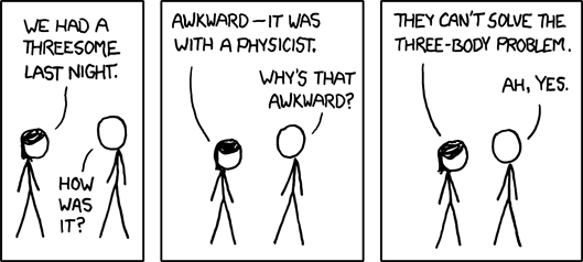
And white ninja has had quite a success:

And Cyanide & Happiness just had a book published as a compilation of their best comics:

Would these work as well if they didn't have low quality drawings? I don't think so. The artwork, the simplicity and the white space is what makes these comics loveable. The comedy and the joke is told as much by the appearance of the characters as by the action development (grid/layout) as by the text.
"The visual representation of the characters will of course, depend on the artists inherent style. This can mean that the design may consist of anything from a stick figure to a fully rendered or photo-realistically painted character." Gary Spencer Millidge, Comic Book Design, p.16, Watson Gutwill: New York, 2009.
Lewis Trondheim, a very well know and respected French comic book artist, which has done such things as A.L.I.E.E.E.N. that has been translated into English, as well as the cat symbol of the Festival de la BD d'Agoulème, the Trondheim cat; has always had a style described as "pared-down cartooning to design different-looking extraterrestial monsters with just a few lines" (p.17, Millidge, G.S., 2009)


Above: A.L.I.E.E.E.N. and The Angoulème Cat by Tronheim.
On the simple character design and comedy side of things, others have managed to become quite well know on good design through comedy, good writting, and great and simple characters.
Simon's Cat, by Simon Tofeild, has just had a book of short comics published, but the cat initially started as short videos on YouTube:
Garry Larson's The Far Side doesn't need any introduction:

And Andy Riley's Suicidal Rabbits (The Bunny Suicides) born and bred in the U.K. are a endless source of joy and he is described as the British Gary larson:

I have myself been experimenting further with white space, stickmen, simplicity, and comedy.

This one's quite Gary Larson-y in style...

Tuesday, 1 December 2009
What is comic book design: covering the basics
"What is design?
Design is an ever-present aspect of modern life. Everything from product packaging to cars, phones, newspapers, cars, phones, newspapers, websites, shop fronts, clothing, advertising, television, and the programs that appear on them has been to conscious and deliberate design.
More specifically, graphic design is said to be all about visual communication, and presentation, a discipline which combines symbols, images, and/or words to express ideas and messages.
More specifically, graphic design is said to be all about visual communication, and presentation, a discipline which combines symbols, images, and/or words to express ideas and messages.
That's not a bad definition of comics itself." Gary Spencer Millidge, Comic Book Design, p.8, Watson Guptill: New York, 2009
That isn't a bad definition of comic books, mainly because comic books are all about design. From character and location design to lettering and balloons passing by page layouts and visual storytelling (all covered in the book Comic Book Designs) comic books are about design. What makes them so close to design is they merge both written storytelling and artistic visual display.
When one looks at a comic book page, what can be seen is an obvious use of a grid, which is an important part of the visual style and storytelling. Then, looking into each square of the comics, one can see another type of grid mixing in a logical and efficient way the textual narration, the speech balloons and the graphic artwork. The design of the comic book has one main goal: telling a story. That's what comic books, and books do, tell a story.
Good comic design doesn't only tell a story, it tells it well. The writing, the scenario, that is all about effectiveness, but the design brings the efficiency to the comics. By designing the comic book page to designing the characters, all matters to tell the comic's story. Different design styles exist, and design has to work hand in hand with the story, the plot, the scenario and the artwork to do its job as perfectly as possible.
Subscribe to:
Posts (Atom)