On writing with Alexandra Kokoli - 3/12/09 and 10/12/09
With Alexandra Kokoli, we were invited to a seminar on writing as an artist spread out over two sessions. In the first session, we looked into the work of Susan Heiler. Looking into the texts, one can see facts in each one have a different focus and perspective. We also looked at texts the using Derrida's method explained in his quote "il n'y a pas d'hors texte", or in English "nothing is outside of text", which is a way of saying that everything is text and open for interpretation.
The vision of having no such thing as "hors texte" is a principle that seems to have been created for design. In my comics, the white space is not directly part of the comic, but in itself reflects choices to leave empty room, to leave simple void around the characters creating its own invisible grid in the comic. Every time a choice is made in the artistic domain, even if it's a choice that is held as meaningless by the author, it will be interpreted. Non-choices are also open for interpretations: by choosing to use a white background in my comics, I chose not to put a visible grid, the choice not to put a grid is one not visible straight away, but one as open to interpretation as the choice of having just a white background.
Alexandra then talked about Walter Benjamin, an adept of the Frankfurt School. Walter Benjamin addressed the subject of the inexistence of a "pure language", a language that covers all possibilities of communication. The concept of pure language appeared to be something easily grasped by those who were bilingual. Using French and English as examples we can show they are not pure languages by simply observing that the vocabulary in English for anything regarding the five senses is much more expanded that the one in French, but the French vocabulary has a wider expression gage for moods. When Walter Benjamin talks about language, and when Derrida talks about texts, they do not mean the purely word based language, but any artistic expression, like Rolland Bartes' myth.
This theory is perfectly applied to the mixed-media comics I have done. By mixing the languages of photography and digitally drawn stickmen, I combine the two languages' possibilities to create a new message that uses the "vocabulary" from both. By mixing the media, analogue and digital, hand drawn and graphic tablet drawn, backgrounds, white spaces and photos, I create a new message. The combination of each message and each medium creates a whole new message which a unique medium could not have achieved because of its limited range.
In the second session, we looked quite closely at artist statements and artist manifestos. We went through the list of what should be contained in an artist statement, and then created as a group our own list of what should be in an artist statement.
The artist statement should contain:
1. Intent
2. Context in the world
3. Context in the art world
4. Context in our own world
5. Critical context
6. Track Record
When the group read their statements and worked on them, a clear line appeared separating designers' statements and artist's statements. The fine art students seemed to be looking inward, up themselves, and the designers had more of an outward look covering what they could do in the future and how they could do for a client.
The difficulty I found in making a statement was that it had to define your way of working and creating art. I do not have a define technique I am trying to perfect for my art or designs, rather preferred methods and subjects. As a designer, being versatile is a very helpful trait, and over specialising is a weakness as being able to adapt to a client's requirements is essential.
After working through each other's statements, we created a list of what a good statement should be, and what it should not contain:
1. Shouldn't overshadow the work
2. Aware of the exhibition's context (to abide by or subvert - must be aware of the reader)
3. Clarity - Jargon and pretension free
4. Considered and purposeful presentation
5. Help to the understanding of the work
6. Must not over-explain
7. Need not hit all the categories
8. Support the work
Artist statements in our context are very much in the area of an exhibition and for the purpose of an exhibition. In the world of comic books, the work, comics, are produced to be published. The intent in creating a comic book is to have it published so it will reach a maximum amount of readers. In other words, the artistic statement behind a comic books is simply to tell a story to others. Every statement I have come across in the comic book world are closer to the designer statements: the artist justifies why he designed the story, layout, visual, text, grid, colours,... to fit the narration. Comic book exhibitions do exist, but the artwork shown was not created with the idea of an exhibition in mind but simply with the idea of letting the readers of comic books see the original work of the artists.
In the case of my comic books, my statement is brief and clear: tell my story in the most basic comic book visual design possible, and express the maximum of emotions, events and feelings with the minimum of artwork. Although my work is not created with the idea of that statement in mind, I see this as more of a technical statement than an artist statement. In the list of what a statement should be that our group created, the first principle of the statement not overshadowing the work would be my primary concern.


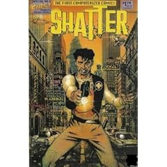
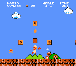 "We are now in a digital age". We sure hear that quite a bit. Comic books have passed into the era of the digital. It all started with Shatter, the first alleged computerised comic first published in March 1985. I was really surprised at the year it all began: it's close to 25 years ago, when we weren't so much considered as being in the digital age. Video games were in 8 bit on the Nintendo Entertainment System, and Supermario Bros had just been released in Japan. I've always found video games to be a good benchmark to see technological advances, especially for comic books.